This add popped up while I was browsing around this morning, and made me think whether it is important to have a unified brand design which is represented in all your products. Take this Ford SUV line-up as an example. You have the compact, swoopy (relatively, of course) Escape with a 4-piece grille, the angry-looking Edge sporting Ford’s toughened-up Aston / Audi-inspired SUV grille, the Explorer whose design was meant to mimic the Range Rover and its perforated grille, and the old-fashioned, ladder framed Expedition sporting the simple grille that used to be the staple of Ford SUVs. Four models, four different looks. But is that a bad thing, necessarily?
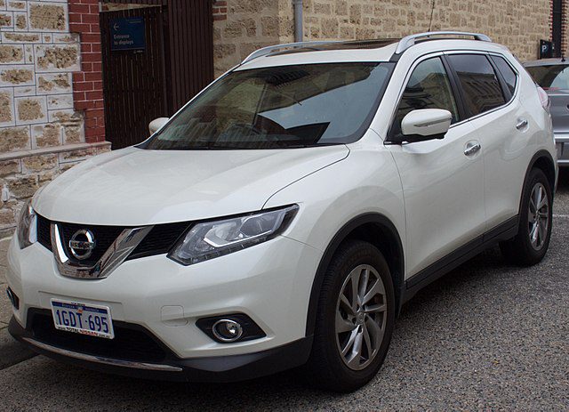
On one hand if you cater the design of your cars to the needs of buyers in different segments you have a better choice of meeting their needs. Think for example of the Juke, which would have never happened if Nissan insisted on keeping a strong link to its Rogue/X-Trail sister. Or what would the 300 look like if Chrysler was adamant at having it look like its smaller sister, the Sebring (ugh, that gives me the shivers…). And efforts by car companies to bring the designs of their unique (usually sports) models and the rest of the range closer often go wrong: think how Chevrolet tried to incorporate cues from the Camaro on the recently-discontinued Malibu, how Mazda facelifted the MX-5 Mk III to give it the corporate “happy face”, or how Ford forced the Aston grille onto the newest Mustang… the list goes on.
Arguably the most common argument against unifying the language is that, if you take it too far, you end up with a “one sausage, different lengths” territory that BMW found itself in the mid-90s, or Audi finds itself now. As a result of trying to have your smaller models ride on the coattails of the larger ones you end up cheapening the image of the latter – the new 7-series may be a technological tour-de-force, but by again looking like an inflated 5-series I think the big limo’s image suffers. The same goes, to an even greater extent, for the A8 and the smaller A4. And even Mercedes-Benz, which for a long time has been successful at making the C-class look like a small S-class (rather than the S-class being an inflated C-class), seems to have taken it too far – it’s newest S-class coupe suffers IMO because it looks too much like the smaller C-class coupe.
And yet, I feel like there are huge benefits to unifying a brand’s design. For starters, you may sell more sedans or wagons if they look more like your more exclusive SUVs or sports car halo models. But arguably even more important is the hard-to-quantify impact that offering a whole line-up with a unified “design vision” has on consumers’ perception of the brand. Think how all Apple products seem designed by the same person with the same principles in mind. In the same way VW has managed to differentiate itself from Ford & Co., partially, I think, by being the popular brand that seems to have a unified design – it may not be the sexiest of them all, but it’s consistent and timeless. Ultimately, while car brands should be careful not to take design unification too far, when applied properly I think it can have great effects on the brand’s image and sales.


