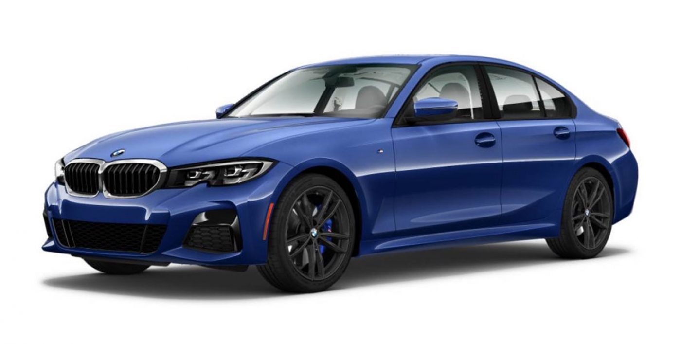
 Only days before the official debut pictures of the new BMW 3-series have leaked onto the internet: delighting some, disappointing others, and leading most of us to re-adjust our glasses to make sure it’s indeed the new model that we’re lookin at.
If it ain’t broke, don’t fix it…
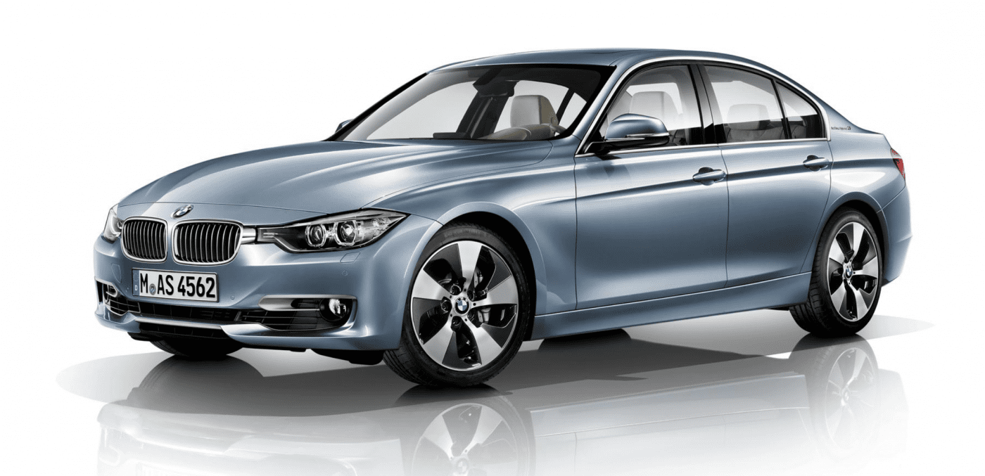
So, what to make of the new design? Much like with pretty much every new Audi, BMW or Mercedes, there was the usual buildup of anxiety before the model’s release – the heart hoping that “this time will be different”, but the head immediately brining expectations down to earth. And, once again, the head seem to have won – the new model is very much a 3-series, changed (if not improved) slightly from the previous generation (see below). That said, after spending some time looking at the progression of the model over the years, it becomes clear that this may in fact be the biggest step-change for the 3-series in a long time.
Changes for changes sake?
With BMW striking gold with the “right-sized” third-generation E36 model in 1990, in the three decades which have followed there has been a sense that changes to each successive new generation of the 3-series could be divided into two groups: the ones that keep the car up-to-date with the latest stylistic changes, and the ones that try to inject something new into the model design language. The latest model, the G20, has quite a few of the latter, from the removal of the horizontal character line that ran the length of the profile in every model since the E36, through the Lexus IS-esque up-kick in the bottom part of the rear doors and the double-kinked Hofmeister kink, all the way to rear lights which are much flatter than ever before (at least on a non-coupe model). The end result is bound to divide punters, with some bemoaning the loss of elegance, while others applaud BMW’s (moderate) bravery to move on.
And inside?
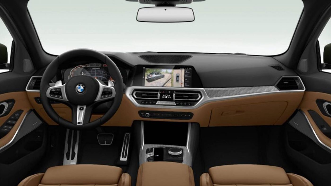
The interior is arguably the most conservative aspect of the new car’s design. The first thing that stands out is the relative modesty of the way that the screens have been incorporated into the interior – neither as a “look-at-me” screen slab, as in the newest Mercedes-Benz A-Class, or as part of a new three-screen, touch-centric interior as on the latest big Audis. This will doubtless please traditionalists and those who value good ergonomics, but at the same time it’s hard to escape the feeling that the 3-series’ interior architecture is starting to feel dated, especially as the design of the section below the vent line (beige in the picture below) seems to have hardly changes since the E90 model from 2004.
Tell us what you think
So there you have it – hardly a revolution, but maybe more of a change than at first meets the eye. The big question now is – what do you think, and does the look of the 3-series matter all that much in the end?


