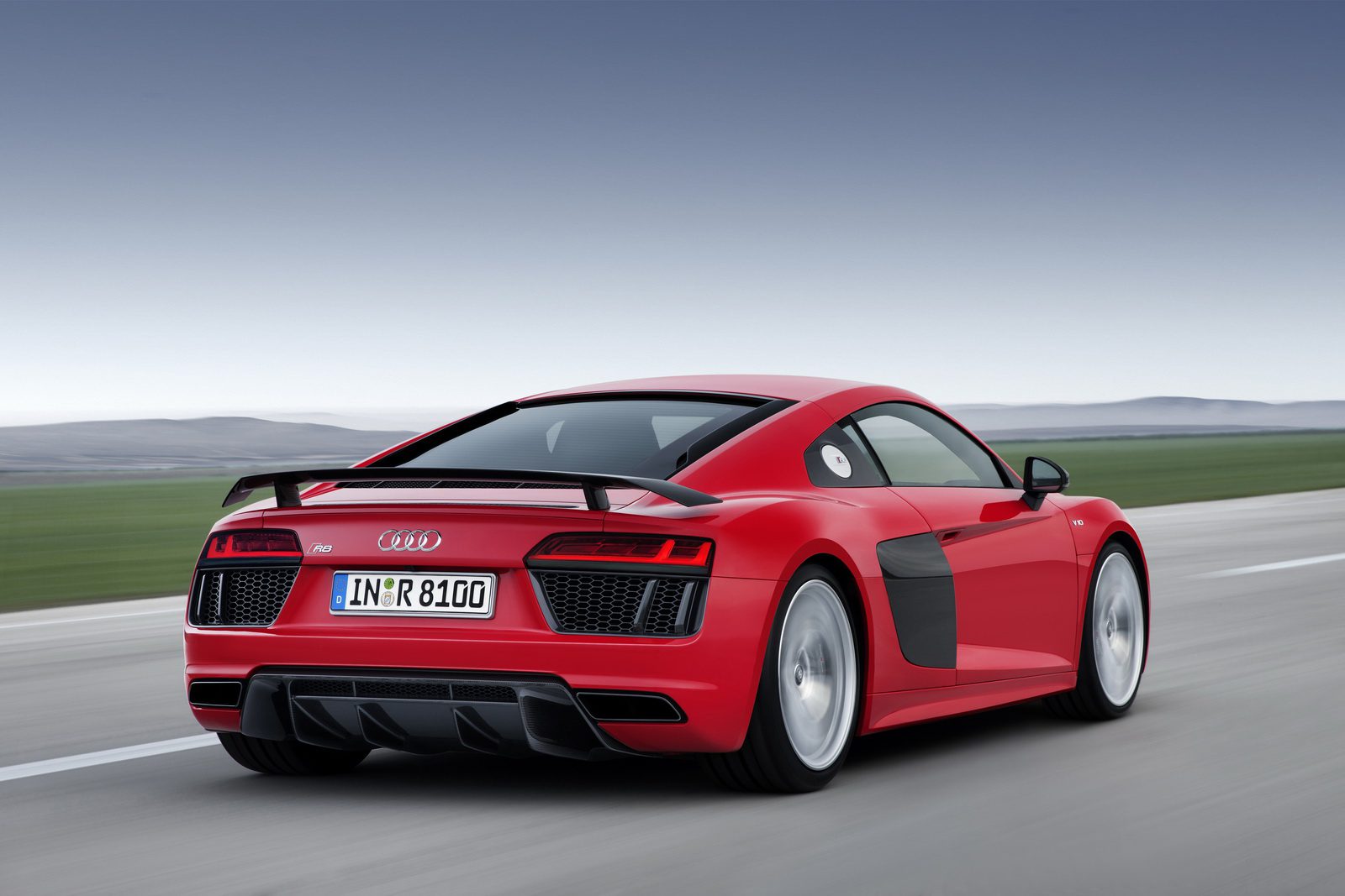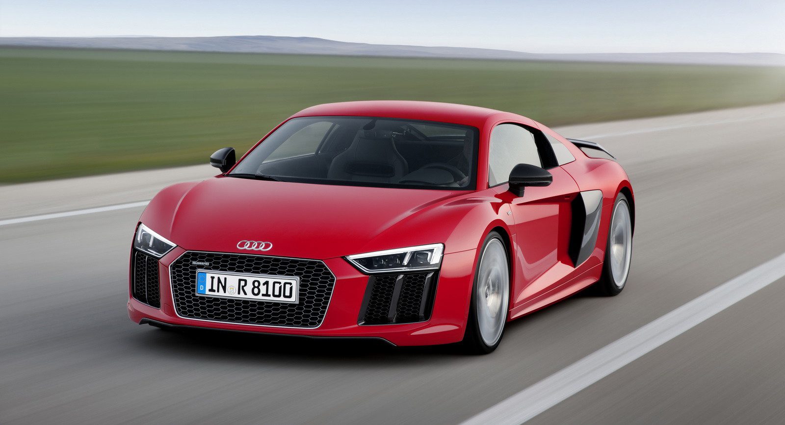
Even as a big Audi fan I have to admit the new Audi R8 looks too much like a facelift of the old one. What’s more, the new details disappoint, from the new hexagonal snout (too blocky, especially the thick vertical parts either side of the main opening) , the loss of the “side blades” which made the previous car more distinctive, and finally the rear lights that somehow look cheap. I really wish the front was more like the spy-shot/fan-made rendering shown below, with its aggressively thin LED lights (never really learned whether this supposed “leaked picture” was real, but it could be it was a proposed treatment for the scrapped R4 baby brother).
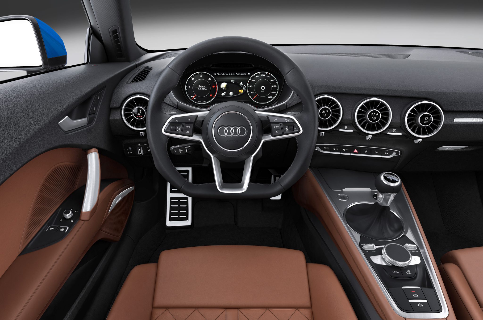
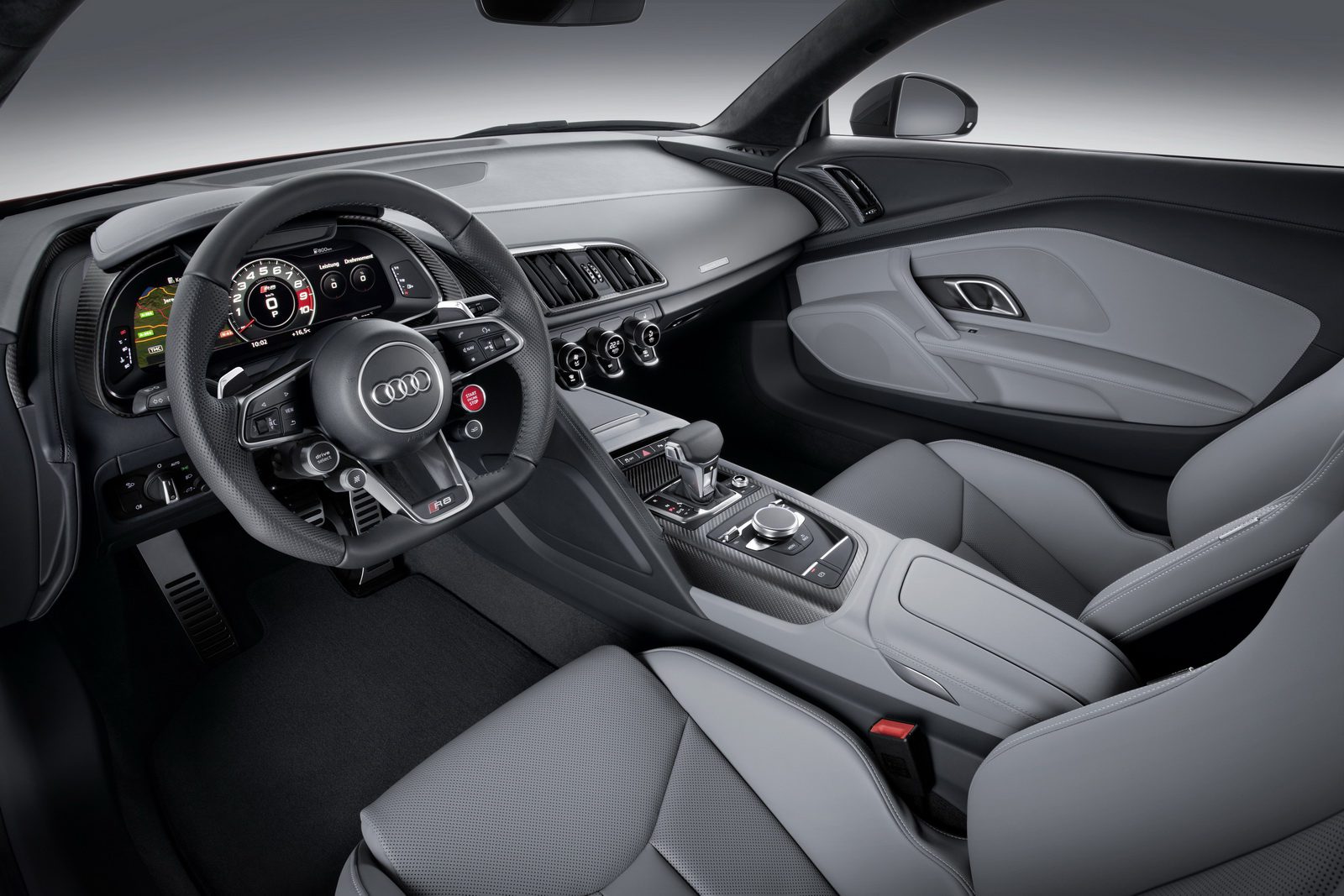
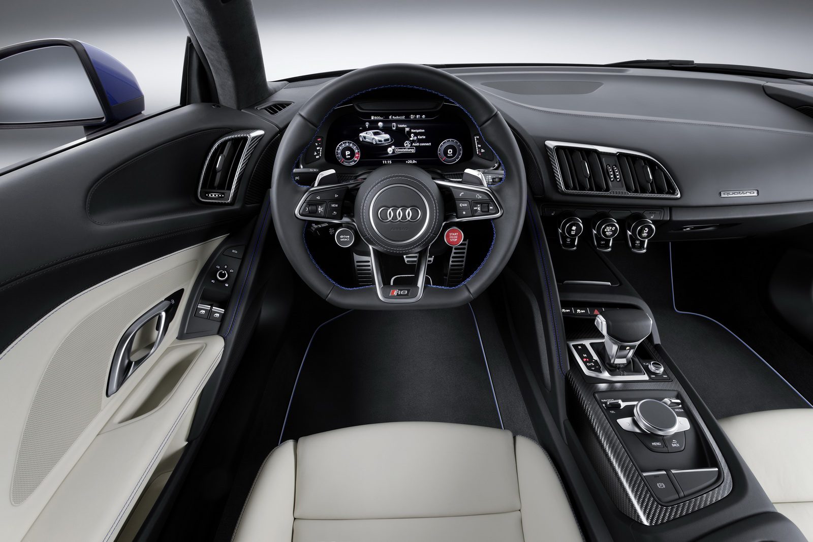
Also, while the interior is nice (it’s an Audi, after all), in my opinion it actually looks worse than that of the TT Mk III – I think the problem is with the air vents, so beautifully detailed on the TT but weirdly shaped and disjointed on the R8.
Still, nothing wrong with the mechanical package (V10 Plus does 0-62 in 3.2s, as fast as the Lamborghini Huracan), and I’m sure it’ll keep selling well for Audi. It’s just a pity that with the eye-popping BMW i8 and the gorgeous new Mercedes-AMG GT as its competitors, the Audi R8 Mk II seems to have relinquished its design advantage without seemingly putting up a fight!

