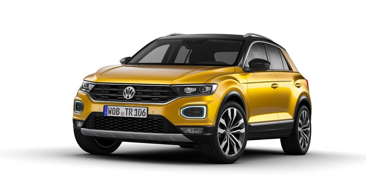
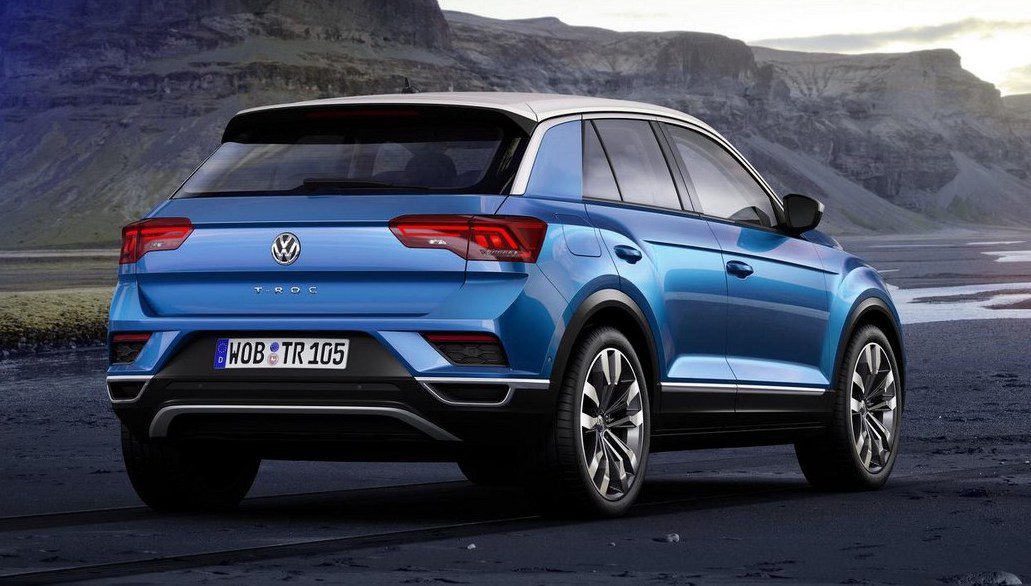
 The new VW T-Roc has brought a breath of fresh air to VW’s design, and unlike the most recent batch of Audis, or the new VW Arteon, it has done so without relying on an exaggerated grille. That said, while it all comes together very nicely, there are parts of the T-Roc’s design that immediately reminded me of cars that have come before it.
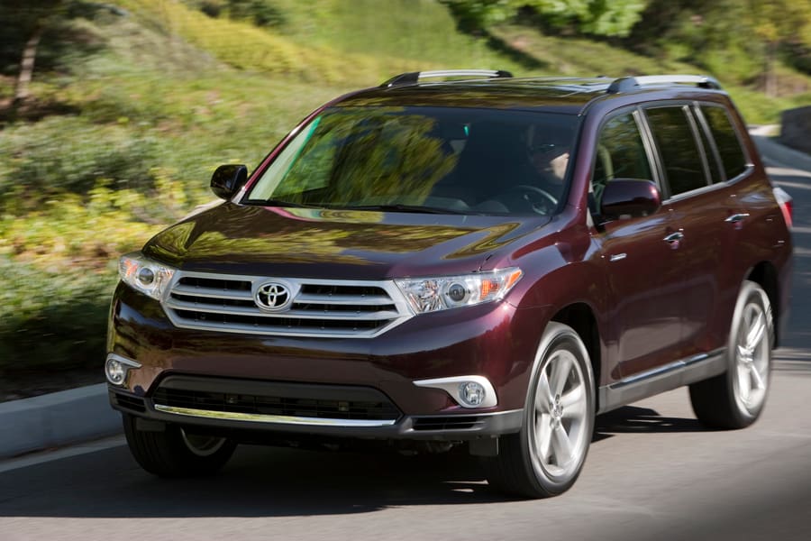
First, the grille and lights assembly on the T-Roc looks a lot like that of the facelifted third-generation Toyota Highlander in the US. There is single straight line that joins the lights and grille, giving the car an aggressive “brow”, while the grill itself has a stretched hexagonal shape with the bottom part reaching lower than the lights do, allowing the latter to be thin and aggressive-looking. Luckily for the T-Roc, its better overall proportions and other detailing at the front (e.g. the cool LED running lights) gives the car an altogether different look than the much larger Toyota family-hauler. It is also a nice illustration of how, if you want to give your car an aggressive look, blacked-out grille and lights with chrome detailing look much better than then lighter color on the Highlander.
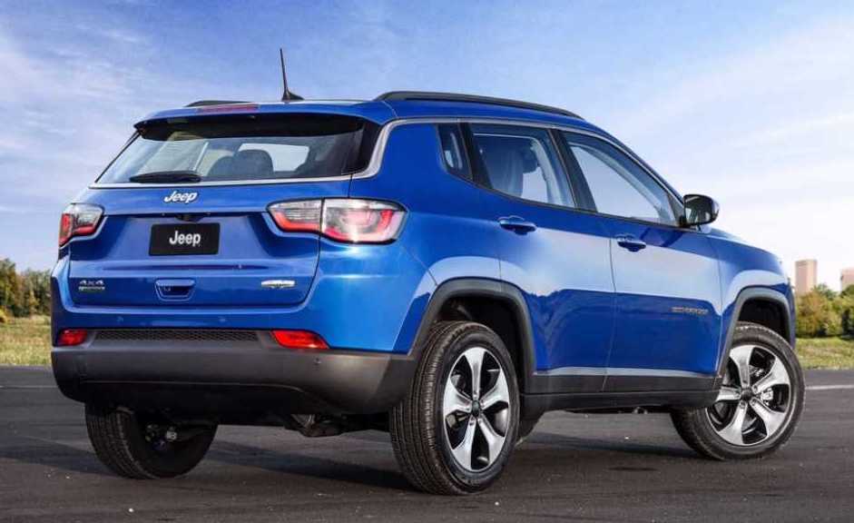
The other detail on the T-Roc that has appeared previously on another car is the chrome line that runs only above the side windows, creating a swoop that goes all the way down to the windowline, framing that back window. In particular, Jeep used this detail to inject the new Compass with a bit more character, though in that case the chrome strips from either side of the car connect under the rear window. And while this chrome swoop looks better on the T-Roc than on the Compass, in my opinion, both are preferable to the “split rear pillar” treatment so beloved of some designers these days (think Opel/Vauxhall Astra, Nissan Murano and Maxima, Suzuki Swift etc.)


