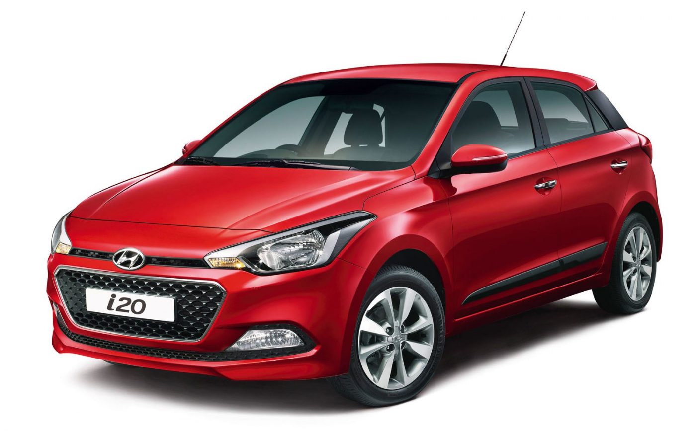
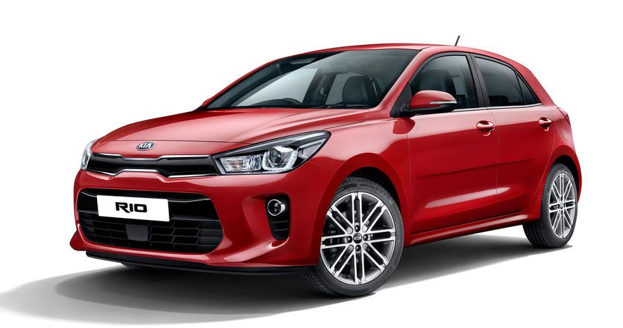
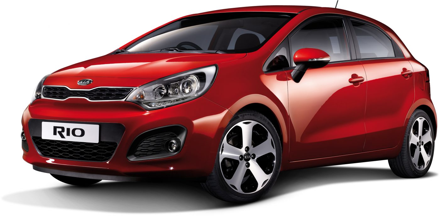
Just yesterday Kia released pictures of the new Rio, and it looks reassuringly familiar – those solid flanks, the handsome front, the slightly aggressive lights. However, unlike with so many new cars these days, this is not because the new Kia Rio looks much like the old one (think most VAG, BMW products). In fact, the new Rio looks surprisingly unlike its dynamic and uniquely-styled predecessor. Rather, it is reminiscent of another car…
…the competing model from its sister brand: the latest Hyundai i20. In fact, the two look so much alike at first glance, that I had to do a double-take to make sure that the Rio was not just a lazy badge-engineering job. However, while most of the bodywork on the Rio is different from that on the i20 (different hood line, different cut line for the A-pillars, differently-shaped window line), the final is strikingly similar. It’s as though the Rio was an alternative design that was considered, but rejected, for the i20.

The sad thing is that the Rio’s predecessor was an altogether more attractive, dynamic proposition, one that still looks fresh today. Where the new Rio seems flat and solid like a brick, the old one was swoopy and dynamic, with a wide stance that was unique to the subcompact segment. It was the kind of car that, if released today, would have still looked great as a new model. And yet while it may make commercial sense for more and more cars to go for restrained elegance over dynamic exuberance in an effort to pry customers away from their VWs and small offerings from premium brands (think the Germanic Renaults, Citroëns, Peugeots), its sad to see designs like the previous Rio be replaced with ones that could have come from almost any brand these days…
See more pictures in the gallery below:
So, what do you think? Let us know in the survey and comments below:


