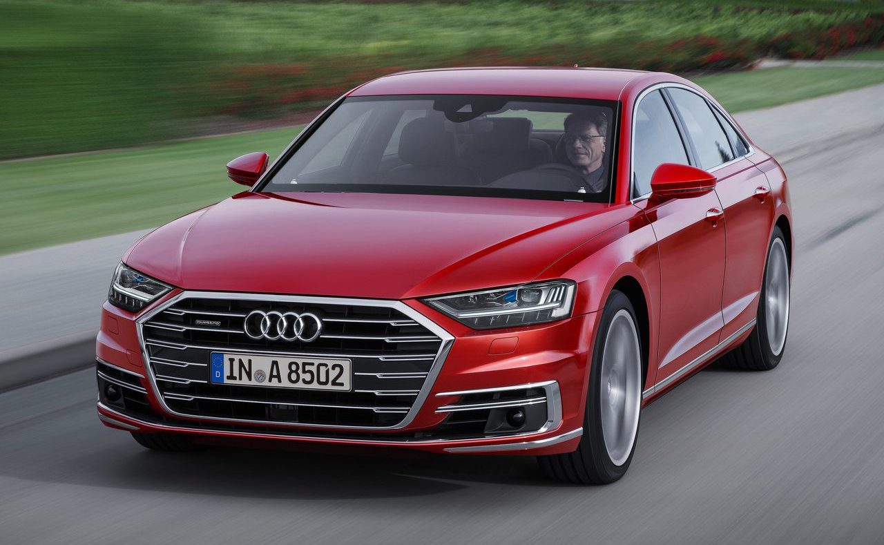
 I think it’s fair to say that the design of the latest Audi A8 has met with a less-than-enthusiastic response. While most of the styling is not in any way ill-judged or controversial, people’s reactions instead fall into a few camps: “wasted opportunity” is a common one, “yawn” is another, while many detractors level the same criticism as they have leveled at most German limousines for the past two decades: “looks too much like the mid-sized saloon blown up by 30%”. While personally I fall into the “wasted opportunity”, there is an aspect of the A8’s styling which actually bothers me, and that is the oversized, chrome-lipped grille that, to add insult to injury, reminds me a of a much-less exclusive car…
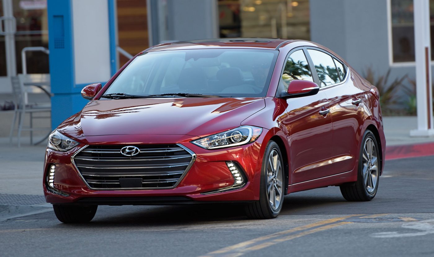
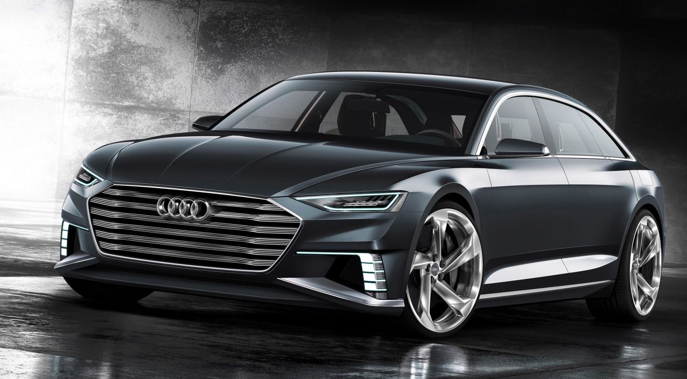
That car is the Hyundai Elantra. Yes, its grille is smaller than the Mack truck-sized item on the Audi, it is set somewhat lower and pretty much everything around it (lights, hood, bumpers) looks different to the A8. The shape and finish of the grille, however, is very similar between the two cars: both have a hexagonal shape with the side corners falling roughly at two-thirds of the grilles’ heights, with thin horizontal slats running the entire width, and the brand logo placed in the upper-center part. What tops off the similarity is the element that bothers me most on the Audi – the thick chrome “lipstick” finish that runs around the grille (though it is absent from the top of the Hyundai grille) simply looks garish to my eyes, especially when you compare it to the elegantly thin chrome surround on the Audi Prologue concept:


