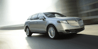
 In conversation with The Good Car Father yesterday, the design of a new Lincoln brought about strong opinions. “What was that new Lincoln I saw yesterday? It looked like a large station wagon”, he queried. “Yeah,” I pointed out, “It sure doesn’t look good from the back, eh.” Accurately enough, The Good Car Father pointed out that “it didn’t look that good from the front”. And the agreed upon viewpoint? The Lincoln MKT doesn’t look good from any angle.
In this situation The Good Car Guy always looks to feel better about the negative vibes. Perhaps the Lincoln MKT needs an aerial perspective or proper lighting or a drunken stupor. In the end, a solution was found. Thirty seconds per photo in Apple’s iPhoto and the Lincoln MKT’s best view was found.
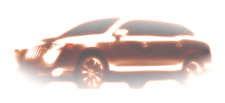
Imagine yourself walking out of the emergency exit of a dark movie theatre during a long night scene in a dark cemetery. You’re in Phoenix, the sky is clear, and it’s 2:00 in the afternoon. The door opens, one foot steps outside, and the you’re so blinded by the sun that spots begin to appear in your vision and deciphering colour is a near impossibility. This is the Lincoln MKT you see in the parking lot behind the theatre; carrying off a decent impression of the gorgeous Buick Enclave.
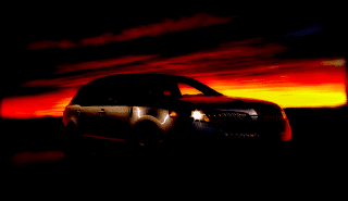
Later on you’re visiting the Grand Canyon. The sunset to the west is unlike anything you ever dun seen, y’all. But storm clouds are gathering in the east. Darkness is about to fall, and the Lincoln MKT parked on the crest of the ridge with its lights on almost has an Audi A6 Avantesque profile about it.





How Ford managed to make the Flex look so good and the luxury alternative look so bad is beyond me. but now it's the same thing with the Taurus and the MKS 2.
The A6 one isn't very A6. but theres a rusprising amount of enclave in that first one.
egad.
if you have nothing good to say….?
interior is spectacular.