It’s March again and true automotive fans know that means the Geneva International Motor Show will open its doors to show the greatest new supercars from niche manufacturers and the latest important launches from mainstream automakers. Cramped together on one of the smallest showfloors in the industry, Geneva is always jam-packed with news and buzzing with excitement. Of course we were there and are ready to give our blunt judgment on all the new production cars that have been launched this week.
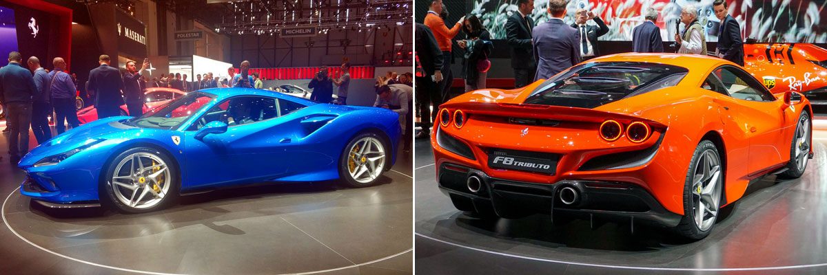
Ferrari F8 Tributo
Kriss: not
Hard to argue with the engineering on the new F8, as it largely builds on the amazing 488 Pista. Beyond that, however, I view most of the changes as insufficient (the interior is still a mess) or even backward (the styling has now completely lost the alluring purity of the 458, with ugly sides and an uber-generic rear, and the name change is completely unnecessary). In fact, if you remember the Lamborghini Canto, the aborted successor to the Diablo, tell me that the huge side vents on the F8 don’t remind you of that? Hard to unsee…
Bart: hot
Ferrari keeps updating its bread-and-butter mid-engined V8 models at a much higher pace than most regular carmakers do, with an overhauled version every five years or less. Where Lamborghini has given the Gallardo a lifespan of 12 years, Ferrari is already introducing the successor to the 488 which replaced the 458 as recently as 2015. These are more often than not just evolutions of the previous model, Ferrari doesn’t even hide the fact that the F8 Tributo is just the latest evolution of the 458 platform and indeed it’s not much more than a reskinned 488 Pista. Then what’s with the completely new name? F8 Tributo is a homage to the V8 engine that the brand is proud of, and rightly so. This is the most powerful V8 the brand has ever built, but I’m just wondering why exactly this would be the right moment to be commemorizing that V8? I’m sure they will continue to develop this engine to make it even more powerful in upgraded or limited editions of the F8.
So, while I have a slight issue with Ferrari’s confusing naming strategy, I disagree with Kriss on the styling as I am a big fan of it. Ferrari themselves say the F8 is “a bridge to a new design language”, and that seems to be a cleaner design than the aggressive and angular 458. And to me that’s what a Ferrari is all about: clean yet athletic design that looks fast even when standing still. For aggressive design, one should go shopping at Lamborghini. Ferrari’s don’t have and don’t need huge tail spoilers and front splitters etc and the F8 Tributo is yet another example of what a mid-engined V8 from Maranello should look like.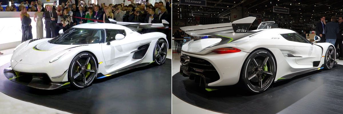
Bart: hot
The Jesko is the successor to the already impressive Agera RS and is possibly even more impressive than that car was when it was first launched. The Jesko (named after Christian Von Koenigsegg’s father) has an innovative system that uses compressed air to build up the turbos and thus eliminates turbo lag. Yet another amazing invention from a company that develops everything in-house, from the door mechanisms to the engines and gear boxes. Speaking of the latter, its nine-speed multiclutch gear box that is said to be able to skip gears and shift at “near light speed”, and is much lighter than a traditional multi clutch ‘box from other manufacturers. Of course the entire car including the wheels is made from carbon fiber. Production is limited to 125 copies to be built within 2,5 to 3 years. Prices are expected to start from $3 million before taxes, and I’m sure they’ll sell them all.
Kriss: hot
There are many things to like about the new Jesko hupercar: it has a new look but is still recognizably a Koenigsegg, the rear spoiler is massively OTT, and it features an innovative 9-speed multi-clutch gearbox that should be able to skip many gears all at once. However, then there are a the stats: twin-turbo, V8, 8,500 rpm redline, and almost 1,600hp. Love it.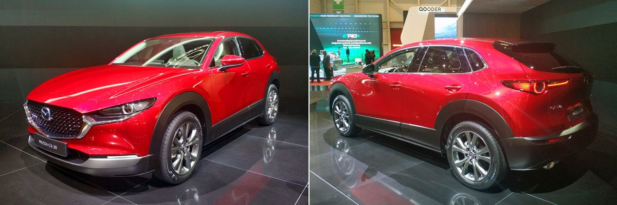
Mazda CX-30
Kriss: hot
There are no two ways about it – the CX-30 is a great-looking car, arguably a more successful design than the new 3 hatchback on which it is based. If the driving experience is up to the usual high standards set by other Mazdas, and the interior is at least a bit more spacious and practical than the 3, then the CX-30 should take its place alongside the Qashqai and T-Roc as a mild crossover success story. Two things niggle, though. First, the unusual name reflects Mazda’s muddled crossover jumble (the CX-30 slots just above the slightly-shorter CX-3, below the taller CX-5, and in essence serves the role played by the CX-4 in the Chinese market). Two: why do the plastic wheel-arch extensions have to be so huge?
Bart: not
As Kriss already pointed out, the wheel arch extensions are huge, and once you see it, it can’t be unseen. And I also don’t see the added value of this car, as it’s actually more of a Cross-version of the new Mazda3 hatchback than it is a true crossover or SUV. Perhaps the huge black surfaces on the sides are needed to camouflage that and to give it some “off-road” credibility? In terms of size, the 3 and the CX-30 are exactly the same width and the latter is just 6,5 cm shorter. So why not save the development money and have made one design for the new Mazda3 HB and a Cross version of it, next to the 3 sedan? Did the Infiniti Q30/QX30 failure scare Mazda off? I think those cars flopped for different reasons than that, but that’s a story for a different time. Yes, the CX-30 looks better than the 3 when looking at the rear 3/4, but that’s mostly because it lacks that weird oversized C-pillar. For the rest, I’d actually prefer the more sporty looks of said 3. So in short, the design is acceptable (apart from the oversized black wheel arches), but I really don’t understand Mazda’s strategy, with all these overlapping and internally competing models (CX-3, CX-30, CX-5 and 3 hatchback). A small manufacturer could make better use its limited R&D money.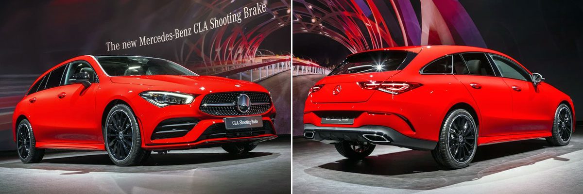
Mercedes-Benz CLA Shooting Brake
Bart: so-so
I’ve never been a big fan of the CLA, both in terms of styling (the dimensions seemd off, plus: front overhang, anybody?), but at least the Shooting Brake added something different to it. The new CLA Shooting brake features the sharper front-end design of recent Mercedes-Benz coupes, and I dig the cleaner sides, but it also has the droopy looking rear-end designs of those recent coupes. Seriously, who thinks the CLS and new CLA look strong and powerful from the rear? Show me some fingers, because I’m not seeing it. The CLA Shooting Brake also seems a bit too narrow when looking from straight behind.
Kriss: so-so
Now in its second generation, the CLA Shooting Brake is a better-looking car than its predecessor, as well as a much more shapely machine than the second-generation CLA “coupe”. With that said, the fundamental problem with this car remains – what does this car represent, and who is it for exactly? If you think that the “CL” models are meant to be sporty, you might find the CLA Shooting Brake to be just a little too humdrum, no matter the swoopy styling. If you need a more practical A-Class, then the CLA SB will be up against some formidable in-house competition in the form of the GLA and GLB. Niche overload?
Peugeot 208
Kriss: Star of the Show
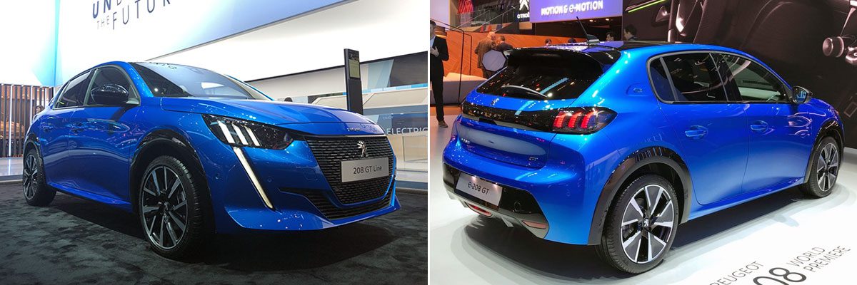
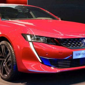
There are so many things to like about the little Peugeot, it comfortably grabs my “Star of the Show” tag. First, there is the styling – distinctively new-wave Peugeot, but with plenty of nods towards the classic 205, including a great stance that makes the car look like it’s hugging the road, especially when viewed from the rear. Then there is the interior, which incorporates the company’s distinct interior design in a small package. But the winner for me is the company’s strategy to offer the EV version alongside ICE versions, using as many shared components as possible. It will be fascinating to see whether the inevitable compromises are small enough to overlook in favor of the flexible manufacturing approach to the upcoming ICE -> EV shift. The new little Peugeot seems to have it all!
Bart: hot
I’m totally on board with Kriss on this one. Peugeot nailed it with the new 208 and this is going to be a real tough nut for the Clio (too evolutionairy?), Polo (too soft and booooooooring) and Fiesta (just lacks the character of the previous one), especially considering there’s going to be an all-electric version available next year. The new 208 looks strong and hunched from all sides, I can’t find any real weak spots in the design, besided perhaps the fangs under the headlights that may not be everybody’s cup of tea. After the making the best looking midsized sedan, Peugeot shows it’s really back with a guaranteed hit in the segment where it counts volume-wise. I haven’t been so enthusiastic about any new car design for a long time. The CMP platform promises good things for the future of PSA’s small models, with its versatility in terms of electrification, which should save them a lot of money when the shift from ICE to EV happens faster (or less fast) than expected.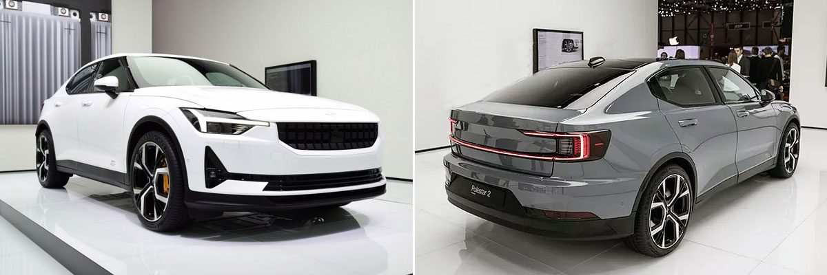
Polestar 2
Bart: hot
To me, the Polestar 2 hits just the right mix between sedan, coupe and crossover. It has a sleek roofline yet a somewhat higher ground clearance and those characteristic black wheel arches, but still a classic sedan silhouette when looking through your eyebrows. It also has that minimalistic and square Swedish design, rounded off just enough to look modern yet timeless. In terms of technology, the Polestar offers similar specs as the Model 3, which means it’s way ahead of anything the Germans are preparing in this price category. Polestar itself considers the ICE players in this segment as more of a competition than the Model 3, as the real challenge lies in getting people out of their diesel or gasoline powered sedan and into a long-range EV. In terms of design and specs, I’d buy into it if I was shopping in this segment.
Kriss: so-so
I really want to be excited about the Polestar 2, I should be excited about it, but really I am kind of disappointed… Don’t get me wrong, the specs for this model look really good, and if Vol… Polestar can deliver on the promised price than it should be a great EV option. However, I can’t escape the fact that the model looks like what a Chinese knock-off of a Volvo may look like, an impression not helped by Volvo’s decision to not make this a Volvo. Surely it would have made more sense to plant this model firmly in the Volvo range, say as the E50, and see it fly off the dealer lots?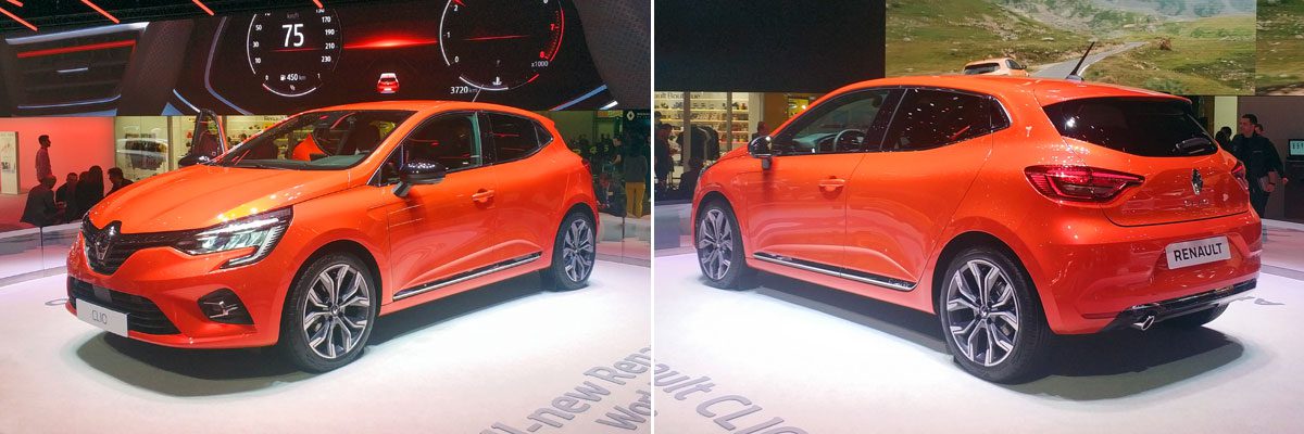
Renault Clio
Kriss: so-so
The new Clio is nice, maybe even very nice in places, but it looks just a little bit too much like the previous generation, and as a result lacks the “wow” factor of the Peugeot 208. Oh, and it really looks a lot like the latest Nissan Micra, with which it shares its platform, surely not what the company intended. That said, the interior is rather nice, and once you see the new model side-by-side with the old one you will appreciate how much of a difference the new model’s larger wheels make!
Bart: hot
The new Clio looks familiar from all sides yet not one panel has been left unchanged. Renault has been thinking “what VW Group keeps getting away with, must work for us too”, and indeed it seems to be working, at least for me. In my opinion the outgoing Clio has been the best looking subcompact ever since its launch, and it still looks fresh so why mess too much with what’s already a great design? They’ve just modernized and sharpened the Clio and Renault would have gotten away with it if it weren’t for that striking Peugeot 208 mentioned above. I saw the new Clio in real life first and was enthusiastic about it. Then I saw the 208, and when I came back to the Renault stand most of that enthusiasm had melted. I still think the Clio looks great, much better than most of its rivals, just except for one. I love that new orange tone, though. I hope this will bring some color to the monotonous European streets.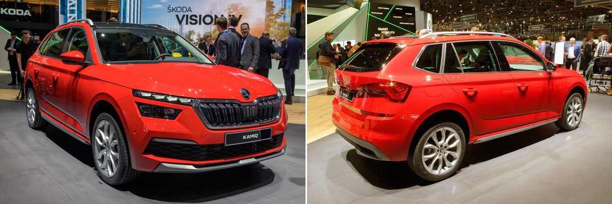
Skoda Kamiq
Bart: not
If I had to choose one of VW’s Group’s new small crossovers, the Skoda might actually be the one I’d pick over the T-Roc and Arona, but that’s less a testament to the strength of the Kamiq’s design than it is to the total apathy I have towards the other two. The Arona’s “frivolous” C-pillar looks like lipstick on a pig and the T-Roc’s design is trying too hard to be too many things. At least the Kamiq has the typical pudency of Skoda design. There’s just nothing exciting about it. But that doesn’t stop Skoda from writing the following sentence in its press release of the Kamiq: “In the language of the Inuit, Kamiq embodies something (…) that has its own character. That suits this car perfectly.” Pick me up and hang me to dry, because this takes the cake when it comes to the most hollow quote in an automotive press release of the year. Its own character? A cookie cutter, dime a dozen crossover that has nothing to set it apart from the masses? From the rear it’s super predictable and recognizable as a Skoda, from the side you wouldn’t be able to set it apart from any other VW Group product and in front they’ve at least tried to decorate the standard Skoda grille with a headlight design Citroën and Jeep have also experimented with (and failed). The Yeti, which this kind-of replaces had character. This has zero character. Like the Mazda CX-30 above, this is positioned as a crossover because that’s what sells these days, but apart from the slightly lifted ride height and the obligatory roof rails, it’s really just a hatchback. It even shares its doors with the new Scala hatchback! Who are they trying to fool here?
Kriss: not
My initial reaction was much in line with Bart’s, but upon a second viewing I think the Skoda’s problem is not so much that it lacks character (those lights, front and rear, are pretty unique), it’s that the character it has is too close to that of its stablemates. Still, while I do like the way the rear lights are much more 3D than most recent designs, the execution of the front leaves a lot to be desired, and this is coming from a person who liked the pre-facelift Jeep Cherokee. Ultimately, I think the Kamiq is probably an example of how doing too little to turn your hatch into a “crossover” can result in a car that, instead of getting people excited to spend a little extra money, has then reaching for an extra cup of coffee.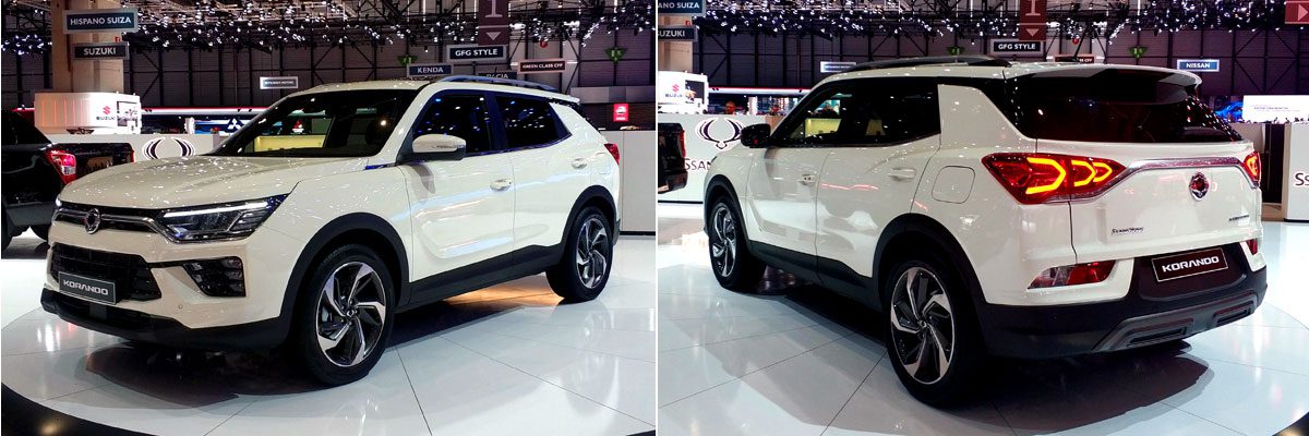
SsangYong Korando
Kriss: so-so
Given that this car comes from perpetual under-achievers SsangYong, I have to say it’s not bad – in fact, if I was “grading on a curve”, I might have given it a “hot” rating. While none of the design elements are wholly original, they come together much better on the Korando than they do, for example, on the Suzuki Vitara or, arguably, the latest Toyota RAV4. Will it sell any better than the outgoing version? It really should, if only because that car was the automotive equivalent of tofu – so bland you could incorporate it into any brand, but not interesting enough on its own to lure anyone.
Bart: so-so
The added value of the SsangYong brand in Europe is still beyond me. The brand offers little that other brands lack and buyers seem to agree, with market share never exceeding 0,13% in the last decade. The Korando is a compact crossover that should compete with fellow South-Korean models Hyundai Tucson and Kia Sportage but its lack of brand recognition and a solid dealer network mean that even undercutting those models’ base price by 15% doesn’t lure more than 5.000 buyers per year, less than half the monthly volume of the Tucson or Sportage. SsangYong design has been the laughing stock of the industry ever since it launched the first generation Rodius/Stavic and has never been able to recover from that image. At first glance, from the front and side, I thought they had actually managed to draw a clean looking crossover. But then the car turned and showed its rear, which immediately quenched those thoughts. The rear end design is very messy: the lights are a bit too large for what’s currently trending, the graphics in those lights are a bit too much gaming industry, and the chrome bar between them is a bit too much out there (and its shape is a straight-off copy from Renault, and the new Toyota RAV4, on which it’s much more subtle). The C-pillar design has been done by more than a few others before, and the wheels look rather small as well. Then the interior is too blingy/shiny for my liking. Still, it’s not an ugly car at all, I just fail to see what the Korando has to offer that others in this segment don’t already have. Especially considering its engines aren’t the most high-tech or efficient either. Until the promised EV version arrives, that is.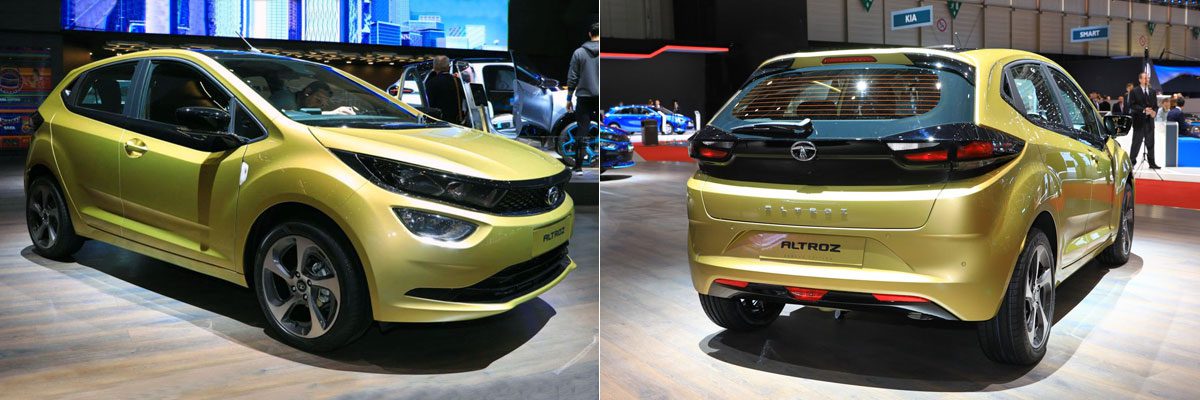
Tata Altroz
Bart: not
Why Tata chose Geneva to launch its new compact hatchback is a bit of a mistery, as the brand currently doesn’t sell any cars in Europe, nor does it have plans to do so in the future. Regardless, it’s positioning the Altroz as a premium urban hatchback, although the premium monniker should be seen in light of its Indian roots, where it should compete with the Suzuki-Maruti Baleno (sold through that brand’s upscale Nexa dealerships) and Hyundai Elite i20. Tata’s hatchbacks and small sedans have never been the pinnacle of design and this Altroz also looks a bit awkward, especially from the side and rear. The dip in the window line below the mirrors is so ten years ago, and so is the black surface between the rear lights. The interior is basic but sufficient for Indian Domestic Market standards as this is focused more on durability than on soft touch or high-tech. Most interesting it the platform on which the Altroz is built. Tata calls it the Agile Light Flexible Advanced (ALFA) platform, and like PSA’s CMP platform it allows for flexibility in power trains from petrol to diesel to electric. The electric version of the Altroz does not set new standards with a claimed range of 200-250km, which should translate to less than 200km in the WLTP cycle, but is a promising first step for a brand in a market that currently has virtually zero EV sales.
Kriss: hot
Unlike Bart, I think the Altroz actually looks pretty great! Sure, so of the design elements are a bit dated, and I never liked the fake, blacked-out window extensions such as those used here and on the first-gen Chevrolet Volt, but it all somehow manages to come together to make the Altroz not just distinctive-looking, but actually attractive. If the EV version can be made available for a reasonably low price, I can’t see why Tata could not sell this car internationally.

