 The Geneva Auto Show is one of the most important in the world, together with Detroit and Shanghai. Every year the Palexpo exhibition halls are jam-packed with exciting new launches from both the familiar mass-market brands and the obscure one-off garage-at-home builders. In terms of new production cars, Geneva never disappoints with more than a handful of all-new cars ready to hit showrooms in the coming months. After walking around on the show floor for two days, carefully observing, inquisitively test-sitting and numbing our ears with the broken record of marketing jargon, we’ve reached a verdict on what’s hot and what’s not.
In addition to the regular poll asking the “which is your favorite?” question, we also thought we’d ask you a slightly different question, more in the spirit of CarSalesBase – “which new car do you expect to deliver the biggest sales improvement on its previous generation?”. Enjoy!
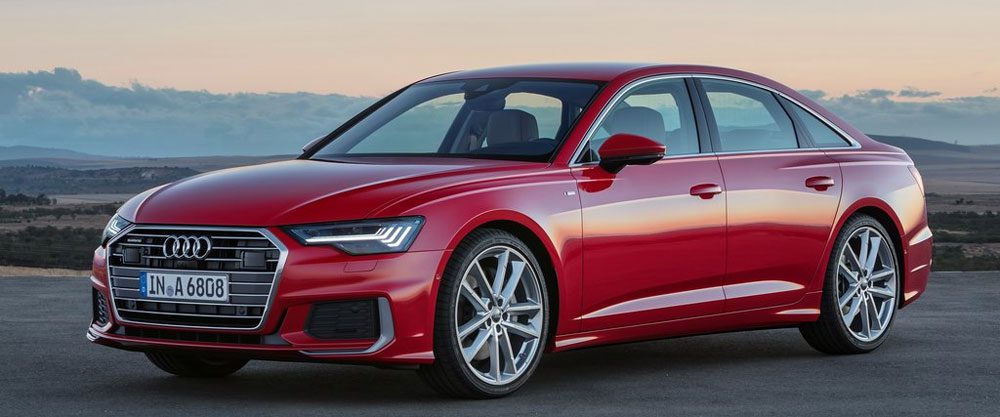
Audi A6
Bart: Not
I like that Audi has chosen to equip the new A6 with a mild hybrid system as standard, at least on the two engines available upon launch. What I absolutely don’t like is that they too chose to opt for a confusing engine type naming system that has no connection to engine capacity or output. Audi A6 50 TDI? Probably just because they want to show a higher number than Mercedes and BMW for a directly competing powertrain. In terms of exterior design, my first reaction was that this was just another Audi looking exactly as you’d expect. And in a way, it is. The grille, the rear light set-up, the beltlines, it’s all very unsurprising considering Audi’s current design language. At a time when cleaner looks are becoming more adopted (see Mercedes-Benz), Audi is going against the trend and making the A6 more expressive than the outgoing model. Still, it does have presence and I must say I like the pronounced rear wheel arches which intend to give the car a muscular schoulder above the rear wheels. Unfortunately, that’s a bit strange on a front-wheel drive biased car….
Kriss: so-so
I know I will be in the minority on this, but I really like the exterior design of the A6. No, it is not as elegantly handsome as the Prologue concept, but in my opinion it has a great stance for a primarily front-wheel-drive car, with the design taking advantage of multiple horizontal lines, huge wheels and pronounced arches to give the car a wide and powerful look, bringing to mind the A8 Mk II. I wish they removed some of the detailing and executed the surfacing with more restraint, as on the Prologue, but this is a step in the right direction for me. Unfortunately, Audi seems to have wilfully shunned elegance in its interior design – big screens are great, but the way the air vents look so cheap and hollow is just shameful. Love the tech, though, and the double screen setup in the middle looks so much better than Tesla’s single giant screen, which I maintain looks like a TV built into a wall cabinet.
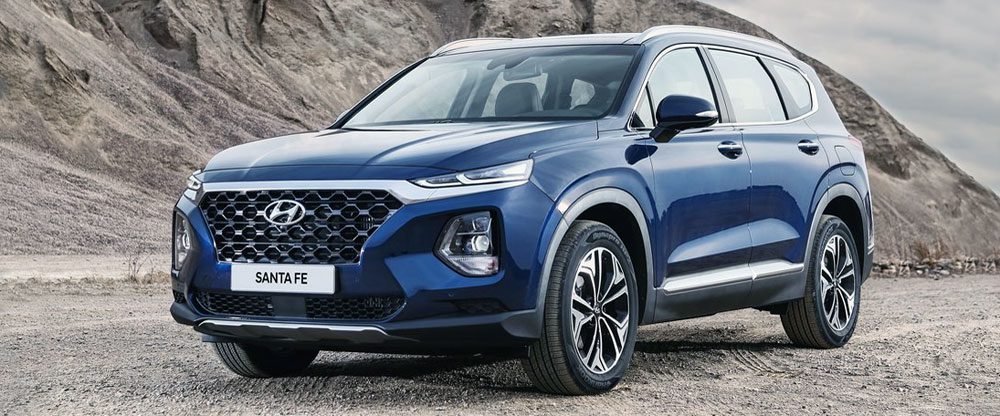
Hyundai Santa Fe
Kriss: hot
I am pretty fond of the outgoing Santa Fe, but I always thought its design lacked the final 10% of polish, especially inside. This model changes all that – not only is the exterior more sophisticated-looking, with taut surfaces and distinctive details in the light design, but the interior manages to look better than Hyundai’s recent efforts, though it does look a bit too much like Mazda’s interiors to be called distinctive. Overall, this seems like a big improvement on the outgoing generation, unlike so many of Hyundai’s recent efforts. It’s just a pity that Hyundai’s new corporate grill relies on concave surfaces, making it look sunken and weak.
Bart: hot
I too liked the current Santa Fe, as the model’s design seemed to improve on every generation. Of course that’s not so difficult considering how absolutely hideous the first generation was. But at least that car was dirt-cheap compared to its rivals of that time and it made the crossover more affordable for the masses. With this fourth generation, the improving looks continue as Hyundai’s new design language for its crossovers looks so much better proportioned than on the Kona. The Santa Fe is also much cleaner than its smaller sibling, without all those crazy lines and different shapes and surfaces. Especially from the rear I find it genuinely attractive. The affordability factor has been long gone, though. Unfortunately, the Santa Fe will initially be available with only diesel engines in Europe, right at a time when other brands are shifting away from the technology and (especially local) governments are implementing regulations that may ban diesel cars from certain areas. There was no word on whether the upcoming hybrid and plug-in hybrid versions will make it to this continent later. This car is primarily aimed at the North American market and will only get tiny sales volumes in Europe anyway, just because European buyers prefer smaller and more efficient models. With only diesel engines they might as well not bother about Europe at all, the hybrid and PHEV versions may have a shot.
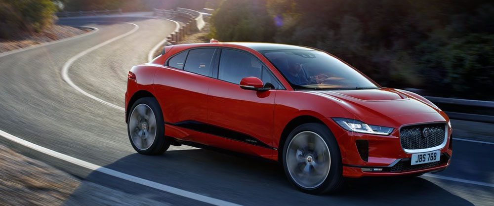
Jaguar I-Pace
Bart: hot
I like the exterior design of the I-Pace, it’s recognizable Jaguar, but still different enough from its non-electrified siblings to stand out. It’s a bit strange though that an all electric car has a grille as large as this. I also like that a mainstream manufacturer has finally made a valid rival to Tesla, in this case the Model X, and the I-Pace has comparable specs to the 100D version of that car, but at a lower price point. The interior of the I-Pace is a bit of a disappointment, though. JLR has shown with the Range Rover Velar that they can build great looking and premium feeling interiors, and they should have gone the same route with the Jaguar. Inside it just feels like a car that’s about three quarters of its price point and it gets easily beaten by the Tesla in this regard. I hope the total package is still convincing enough for this car to become a success and that it will inspire others to up their EV efforts as well.
Kriss: so-so
Again, I may be in the minority on this one, but I don’t think the I-Pace is a great Jaguar. A nice car, sure, but other than the distinctive grille and headlamps the looks is very generic, making it look more like a pumped-up Kia Nero than a Jaguar. Add to that an oddly puffed-up and uneven profile, accentuated by the lack of visible doorhandles (Tesla silver ones are a much more elegant solution), and to me this car simply does not look desirable. The interior too is a mixed-bag: super-sharp and attractive displays are housed with a thickly-drawn generic dashboard, with air vents whose shapes weirdly is at odds with that of their housing. Can’t deny the impressive spec, but even here the maximum 310 miles range is made to look pedestrian by the almost-300 mile range of the new Hyundai Kona EV.
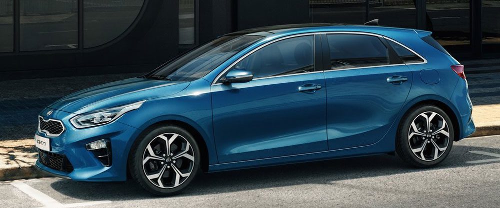
Kia Ceed
Kriss: so-so
The new Ceed is not a bad-looking car, it’s just that it seems like an unhappy marriage of styling elements from the Stinger onto a very generic hatch shape. As such, it is neither as dramatically-proportioned as the Stinger, nor as swoopily dynamic-looking as the C’eed Mk II (a problem also suffered by its Hyundai i30 cousin). The interior too fails to move the game on, with a layout that already looks old-fashioned, and a screen that seems like an after-thought. Kias used to be exciting and progressive, but this simply seems like a safe, middle-of-the-road hatch. Pity…
Bart: so-so
The Ceed is a prime example of Kia doing what Kia does best: to build great middle-of-the road cars that are average or slightly above average in every aspect and that offer a design that offends nobody. This is just as true for the third generation as it was for the first two (bar perhaps the Pro_Cee’d GT). Consider this to be the new Astra since that model has tried to move upmarket as almost any other mainstream brand has. In this field, the Ceed is a breath of fresh air with its no-frills attitude. It’s just too bad that they’ve proven with the Stinger that Kia is capable of designing and building great cars that people would actually want to buy.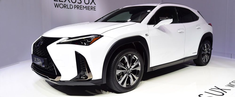
Lexus UX
Bart: not
I’ve said enough about Lexus’ spindle grille, so I won’t waste any more words on that, but the front may actually (and surprisingly) be the most attractive side of the UX for me. There’s just way too many detail in the design for such a small car, it’s just way too busy, perhaps even more so than the Hyundai Kona. The wheel arches have too much black plastic around them in a strange shape, the wings on the rear lights are a nice touch but get lost in the visual overkill with other details. The interior doesn’t match the exterior as all craziness has been filtered out there. Different for the sake of being different never really worked for anything, and the UX is no different. I get that Lexus wants (needs) to stand out to attract the buyers that are unimpressed by the Audi Q3, but it’s a pity that a car that’s has great technology is burdened by looks that scare away a large portion of the buyer pool.
Kriss: not
You have to wonder whether Lexus designers don’t have a good handle on surfacing, or whether they make their cars looks awkward on purpose. While the the great-looking LC suggests that they can get it very right if they try (and have a great-proportioned platform), the UX looks much more like their recent efforts – weird for the sake of it, with some design elements purposefully overblown (the spindle grille, the side creases), others oddly restrained (the headlamps, the proportions), and others that simply make no sense (the fake vents under the headlamps). At least from the rear 3/4 the full-width light cluster gives the car a distinct character. With the interior being nothing special, and the base powertrain being a weak 4-cyl mated to a CVT, it’s up to the optional hybrid model to make things interesting with on-demand 4-wheel-drive system that relies on an electric motor to drive the rear axle. Hopefully it’s better executed than Peugeot’s inefficient and heavy system they offered in the early 2010s.
Mercedes-AMG GT 4-door
Kriss: so-so
This car would make a pretty nice Mercedes-Benz CLS. Unfortunately, the company decided that instead it wanted both the CLS and a 4-door AMG model, but to save money it twinned the two and make them look much too alike. What’s more, I feel like the need to make the AMG version more distinctive forced the Benz version to do with a dour-looking rear end, while the AMG version’s desire to be seen as a longer GT model (which it really is not!) resulted in some ham-fisted detailing, such as air vents behind the front wheels that make Buick’s efforts look well-integrated, or a gigantic middle console inside, one of the less-appealing aspects of the proper GT, which cannot disguise the absolute lack of sportiness of Benz’s standard rectangular instruments and screens. At least the rear looks nice…
Bart: not
… and that’s exactly where I disagree with Kriss. I love the interior, Mercedes is so far ahead of its rivals in this respect that you wonder what the others have been doing all this time. It looks great, feels great, works intuitively and makes me feel at home immediately. I also love the idea behind the four-door AMG GT, as the combination of a sporty yet comfortable GT with room for four seems almost perfect. But I just can’t seem to get used to the current design language on Mercedes coupe rear ends, and this is no different. It doesn’t look heavy enough, it’s too low and too sad looking. I’ve never been a huge fan of the first generation Porsche Panamera, but the second gen has improved quite a bit and the Sport Turismo version is actually good looking. Better than this AMG GT four-door for sure.
Mercedes-Benz A-Class
Kriss: so-so
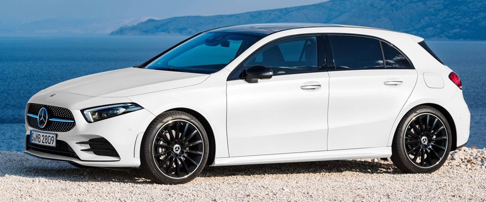
To me this car is a curious mix of hot (interior, tech), so-so (mechanics) and not (exterior). On one hand, the interior is rather stunning, with Mercedes fully embracing the double-screen display and doing away with the instrument cowl altogether for a minimalist look, though the steering wheel overloaded with buttons ruins that effect somewhat. On the other hand, the exterior is both anonymous and a bit ungainly, with an artificially-elongated nose giving the front-wheel-drive car a huge front overhang, and the rear lamps lacking the elegance expected at the premium end of the segment. With no hybrids, mild or plug-in, the engine offering looks decidedly pedestrian as well, though that may change in due time.
Bart: not
I’m on the same page as Kriss on this one. The first Mercedes-Benz A-Class hatchback (considering the first two generations were really MPVs), is perhaps the best example of the brand’s expressive styling with the dramatic lines and creases. Gordon Wagener, the brand’s design chief has admitted that’s what they needed to do with this car in order to stir some life into the brand, but that now they’re moving to much cleaner and simpler designs. Unfortunately in the case of the A-class this has resulted in a rather anonymous hatchback. The front has some identity with Mercedes’ new headlight design but especially the rear could have just as well been the new Kia Ceed. In the interior I love the huge double screen that the brand is spreading across its line-up, but the attention grabbing air vents have gone past their prime.
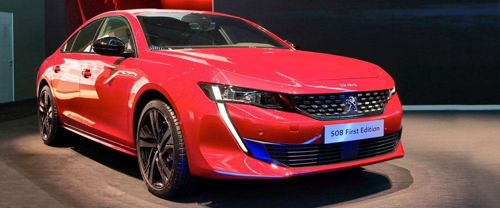
Peugeot 508
Bart: hot
This is one sexy sedan (ok so officially it’s a liftback, and there’s even an argument for calling it a four-door coupe) with an equally amazing interior. In a time when everyone is buying crossovers because they’re cool and practical, making the sedan sexy and desirable again is the only way to go. The optional GT interior offers great looking and perfectly fitting sports seats, the i-cockpit gives the car a premium feel that in no way is an underdog to what the luxury brands currently offer. Chapeau Peugeot for realizing just another vanilla mainstream sedan wasn’t going to cut it anymore, but also not wanting to give up on the segment completely. On the other hand, newly found sister brand Opel/Vauxhall also followed the same strategy with the Insiginia and so far this hasn’t been able to break the sales dominance of the VW Group with the Passat and Superb.
Kriss: hot
You have to feel for brands like Peugeot – once they used to make highly-desirable mid-sized cars like the 405 and 406 that sold by the bucketload, only to see the likes of Audi, BMW and Mercedes-Benz expand their portfolio and muscle their way into their customers’ wallets. So I believe Peugeot deserves double credit for the 508 – not only did it not give up on the segment, but it delivered a car that is distinctive, desirable and genuinely innovative in some ways. I fully agree with Bart that the car looks great outside, but it’s the execution of its i-cockpit concept that really impresses – the three-dimensional sculpture that is the interior could teach the Audi designers a thing or two! Whether all this translates into better sales remains to be seen…
Range Rover SV Coupe
Kriss: not
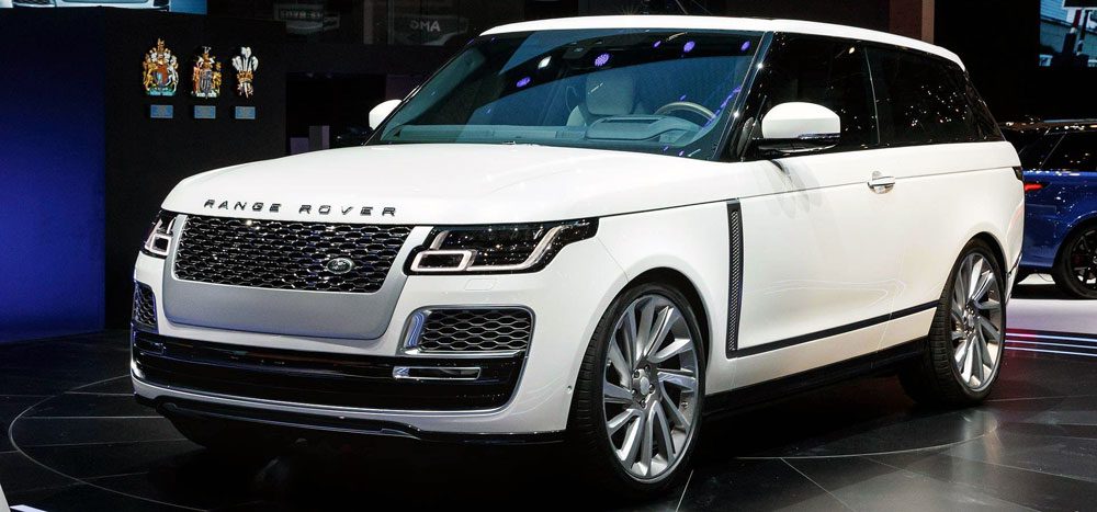
I really like the idea of this car, sort of an elegant grand-touring-like Range Rover for those who rarely carry extra passengers. However, the execution falls well short of what I envisioned, combining the worst of many words. First, with no changes to the wheelbase and barely any to the bodywork short of removing the rear doors, the SV Coupe looks more like a delivery van or hearse version of the regular Range Rover, rather than an elegant grand tourer. Second, if the carmaker cared enough about practicality to hardly alter the roofline, then why did it remove the rear doors in the first place, making the car much less practical? Finally, because it’s bespoke model spun off an existing platform, it is horrendously expensive. Overall, this seems like a desperate attempt by Land Rover the drag the aging Range Rover into a segment it simply cannot compete in.
Bart: not
Is this Range Rover’s answer to the Lamborghini Urus? I’d pick the Lambo over this any day of the week. It’s less practical, worse looking and much more expensive than a regular Range Rover, so what’s the point of it? No thanks.
Rimac C_Two
Bart: hot
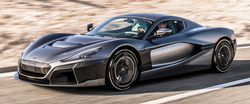
If the Concept One was an impressive car, the C_Two even does one better! 1.914 hp, 2.300 NM, in 2 seconds from 0 to 100 km/h and a top speed of 412 km/h…. If they can actually deliver these specs….. Wow! Even if this never makes it into production, this car is a great advocate of what EV technology is capable of and makes it obvious that even the true sports car lovers don’t have to be afraid of the future. This is like a modern-day Viper: raw, powerful and intimidating, but where the American was an old-school dinosaur, the Croat is futuristic. And it looks impressively clean and mature for a start-up sports car maker.
Kriss: hot
I am 100% with Bart on this one – the C_Two is an impressive beast of an EV, exactly the kind of car you need to get car enthusiasts excited about cars with electric propulsion. What’s more, the craftsmanship of this car seems to be a significant step up from the Concept One – with beautiful light-brown leather, aluminum, carbonfiber and high-res screens the interior looks rather stunning, like a high-tech take on a Pagani. If only the exterior looked a bit more original, with the front looking a tad too much like a mix of an early Tesla Model S and a Lotus Elise, and the rear owing a lot to the likes of BMW i8 and McLaren 570GT.
Toyota Auris
Kriss: hot
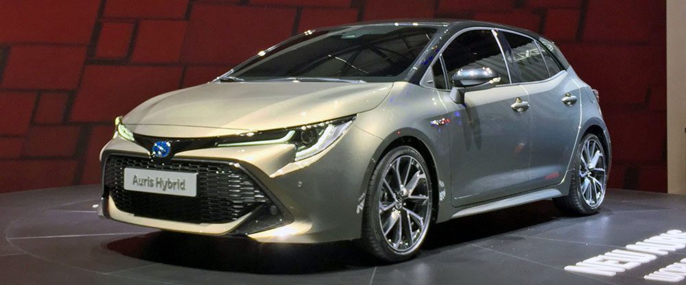
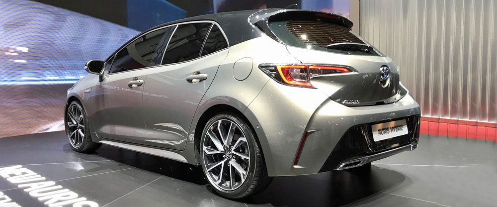
I was on the fence on regarding this one, but in the end I have to admit that I really like the new Auris despite some minor stylistic quibbles. Is the front grille a bit too large and the creases that bleed from the rear bumper onto the rear hatch unnecessary? Yes, they are. But the end product is still nicely proportioned and distinctive, with an instantly-recognizable front look (love the lights!) and a pert rear tail whose shape owes more than a bit to the Seat Leon. What’s more, it’s an interesting move for Toyota to offer not one but two distinct hybrid options, in addition to a small 1.2 turbo – could be good for sales if dieselfobia continues in Europe.
Bart: so-so
The design of the new Auris is not very coherent. The rear end is almost old-fashioned except for the huge bumper and diffuser, the sides are very clean, while the front is super aggressive again. I hope the bumpers and grille get toned down in the regular street versions as this seems to be a bit over the top. Peugeot has quit the huge grille designs because they didn’t work, so now Toyota has picked up the trend. They have gone from way too boring to too expressive in just a few model generations and can’t seem to find a middle road in its designs. All this is way too distracting from the fact that Toyota will no longer offer diesel engines in Europe and that they’ve got a 2-liter 180hp hybrid option. Hasn’t the failure of the fourth generation Prius proven that too extreme designs just don’t work, no matter how great the underlying technology is? Oh, and please help spread the word that this contrasting roof two-tone trend needs to end now!
On the other hand, it’s still a dozen times better than what Honda is trying to sell under the Civic name….
Let us know your thoughts in the comments and the two polls below:

