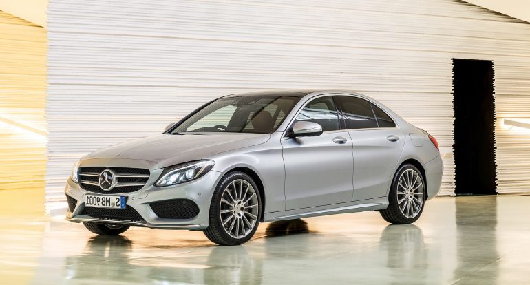
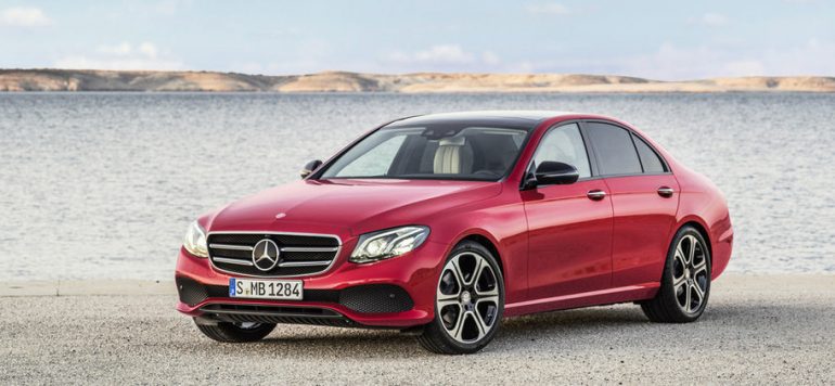
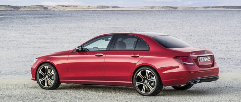
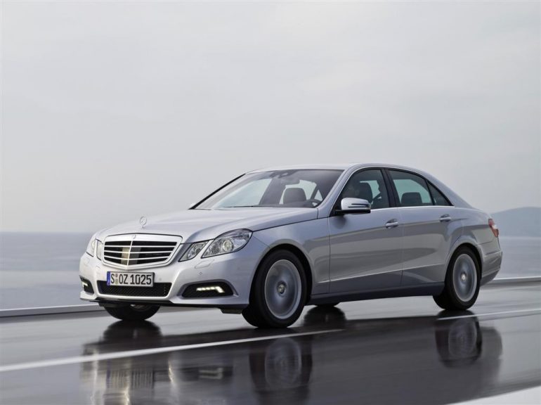
Yesterday Mercedes-Benz finally released pictures of its new E-class, and it looks exactly like we expected it would look: a blown-up C-class or, if you’re being generous, a shrunken S-class. In fact, this may be the closest that Mercedes has brought its three sedans since the W202, W124 and W140 of the mid-1990s. 
While the 2013 S-class was the first car to roll out the new styling, it’s the C-class that the new E-class is most similar to. When viewed from the front 3/4s, the two look like two versions of the same car, as though Mercedes-Benz was so happy with the runner-up design for the C-class that they decided to make the E-class based on that. The only differences that stand out to me are the slightly different lower part of the front bumper, and a slightly more curved character line on the side of the C-class.
Now, don’t get me wrong – I really like the new E-class, and think it may be the best-looking of Mercedes’ new triplets. The rear lights in particular are better-resolved than on the C-class, where they look a bit melted. Ironically, they remind me of the rear lights on the previous-generation C-class, with a sharper upper edge than the jellybean items on the current C-class or S-class.
What do you, dear readers, think? Do you like the new model enough to forgive it its lack of originality, or do you think that Mercedes-Benz has gone too far in making its cars so similar that they make Audi’s models positively differentiated?


