Next weeks the doors of the oldest auto show in the world will open its doors to the public again: the biennial Paris Auto Show. Despite breaking through the 1 million visitors barrier the last time around in 2014, a number of brands have cancelled their stands this year, most notably Ford, Mazda and Volvo, but also many exotic brands: Aston Martin, Bentley, Bugatti, Lamborghini and Rolls-Royce. Still, there’s plenty of news with 4 major premieres and a bunch of interesting concept cars. Bart and Kriss will give their vote of Hot or Not to the most relevant of them. Let us know what you think in the comment section below.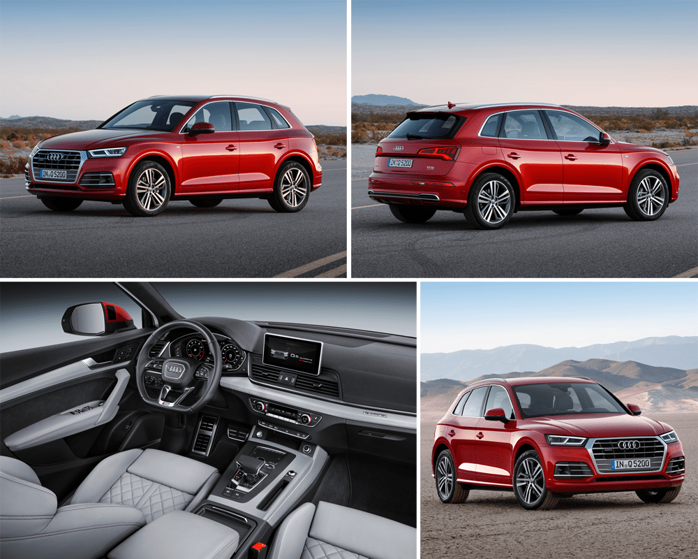
Audi Q5
After 8 years it’s time to replace the very successful Audi Q5, and why change a winning formula? As we’ve come to expect from Audi, the design of the new Q5 is very evolutionary, with the overall shape staying the same, but a stronger and more swooping crease in the sides and a more pronounced grille. The Q5 sheds some weight compared to the outgoing version and the interior is even more refined.
Bart: So-so
It’s not ugly like the Q2 and Q7, what was good in the old Q5 has been left alone and they’ve improved the things I didn’t like too much. Impressive how an 8-year old design needs just such subtle changes to remain fresh. But it’s just not very sexy or mindblowing, so I struggle to call it Hot.
Kriss: Hot
It’s no secret that I am a fan of evolutionary design, something that’s normal for most high-end consumer products (think appliances, fountain pens, Apple products, eyewear) but somehow gets lambasted for cars. The new Q5 is a perfect example of that – it takes what was good about the previous model (stance, proportions, gently bulging fenders) and gives it a more modern touch with sharper creases, a clamshell bonnet, and Audi’s new “3D” grille it now gives its crossovers. That it’s lighter and roomier is just the icing on top of the cake.
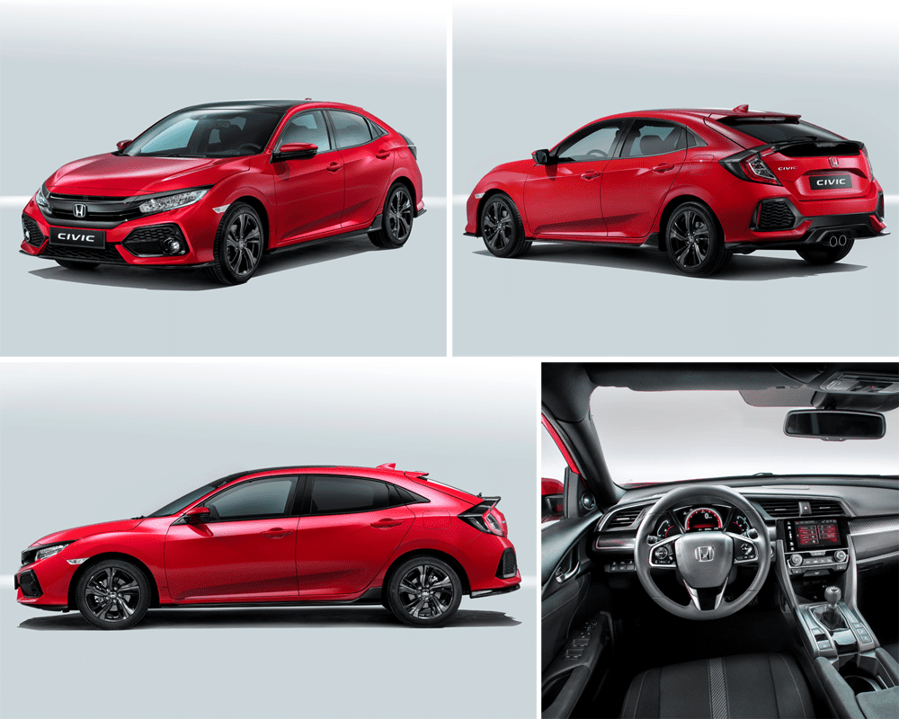
Honda Civic Hatchback
Honda ditches the futuristic design of the previous 2 generations Civic hatchback to go for a more traditional look for the 10th installment of its bread-and-butter hatchback. The styling is now more in line with the sedan and coupe for the American market. The interior remains as futuristic as before, and a station wagon version is also planned for the European market.
Bart: Not
I liked the 8th generation Civic hatchback and found the 9th generation a bit over the top, but at least it stood apart from the crowd. This one? It’s just plain ugly. Especially when seen from the side, the dimensions are simply not right, it looks too stretched in my opinion. I also find the nose way too busy, I can see why they finally wanted to make one Civic for all markets around the world, but as Ford has also experienced: consumers in different parts of the world have different tastes.
Kriss: Not
I agree with Bart – this car looks like a mess, and continues the downward spiral that started when the great-looking (if ergonomically-compromised) 8th generation Civic was replaced with the over-designed 9th gen model. Where we disagree is that I actually like the Sedan on which the Hatch is built, including the nose – I see a lot of them in the US, an in person the nose looks aggressive with its negative camber, evoking memories of late-80s BMWs. But then every step that Honda took to turn the Sedan into the Hatch is for the worse – overdone (fake) air-intakes, plain black detailing, fussy broken up shoulder-line on the rear doors. The only saving grace is that it runs a bevy of new small turbo engines.
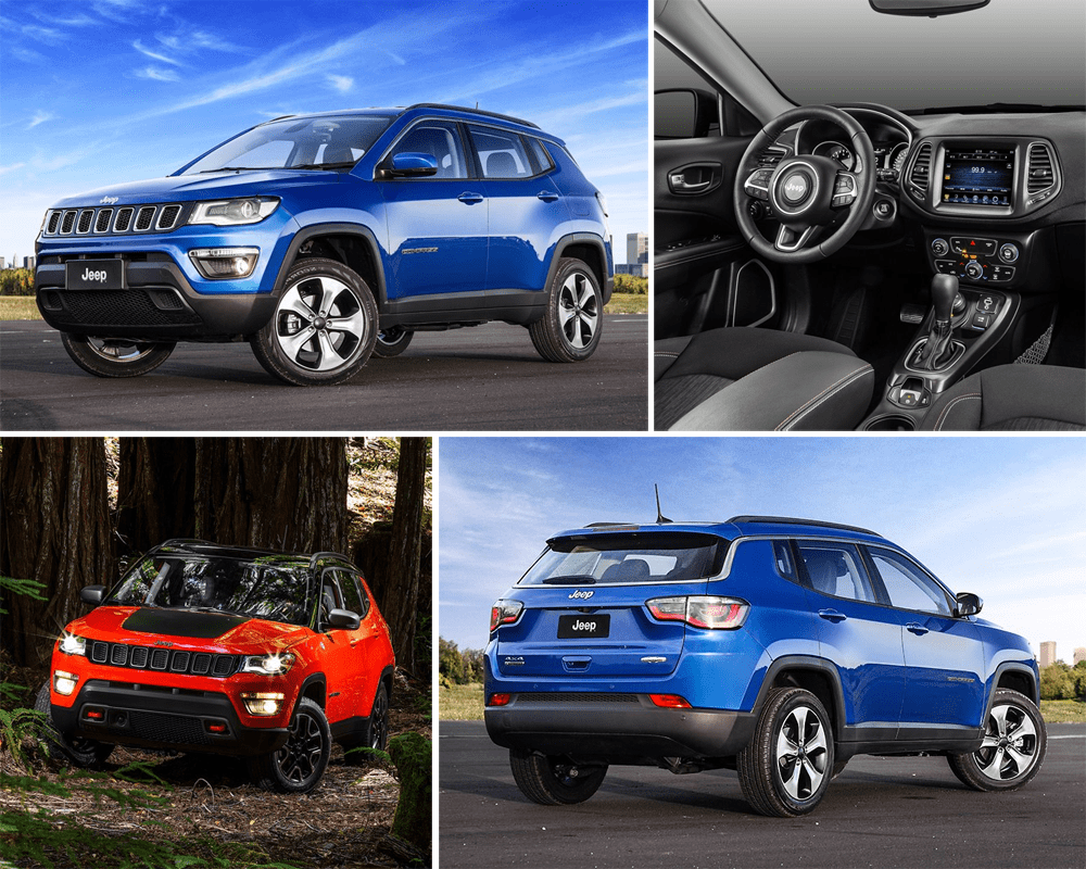
Jeep Compass
Though technically not a Paris premiere, this one’s still fresh enough and relevant enough to be featured here. Jeep replaces the aging Compass and Patriot with a single model. It appears the goal of the new Compass has been to look like a small Grand Cherokee, and the designers have succeeded in that mission. Undoubtedly, this car will expand Jeep’s footprint even further, especially in markets outside of North America. The Compass will be produced in Brazil, Mexico and China and will be sold in over 100 markets across the globe. It’s based on an extended platform of the Renegade and Fiat 500X.
Bart: Hot
I like the direction in which Jeep is moving with its designs, and the Compass is no exception. It looks trendy but not in a way that it’ll be outdated within a few years. It’s also still easily recognizable as a Jeep and the interior looks great, especially when compared to that of the previous generation before the facelift.
Kriss: So-so
I really liked the Compass when I first saw it, but as more pictures came out I realized that its looks are very specification-dependent: it needs really big wheels to look good. What’s worse, it looks like a model from some five years ago, before the Grand Cherokee (whose design the Compass copies) started looking long-in-the-tooth. But what really makes me scratch my head is how this model fits with the existing Jeep line-up, especially the Cherokee, which is similar in size and also offers 5 seats.
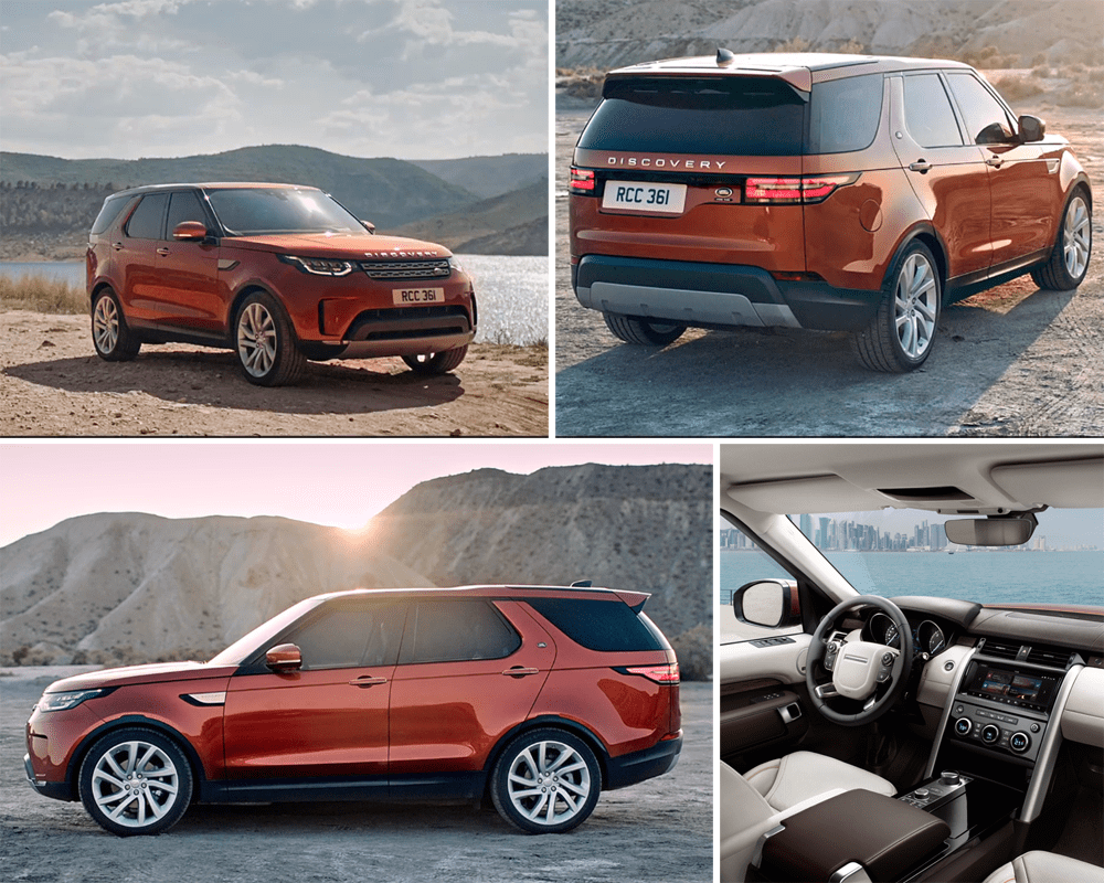
Land Rover Discovery
The long-awaited replacement to the current Discovery (LR4 in the US) remains a more than capable off-roader for the entire family. The fifth generation Discovery still seats 7 and is able to go places unreachable for most other cars and crossovers. Its design is not very surprising, as it looks like a larger version of the Discovery Sport. Land Rover has been able to shed a ton of weight (480kg!) compared to the outgoing model thanks to being built mostly of aluminium instead of steel.
Kriss: So-so
The Discovery is further proof that Land Rover went off-course, stylistically, when it decided to crib the Evoque’s swanky looks for the Discovery Sport. The new Discovery tries very hard to fit those same design cues onto a larger body, but the final result looks awkward, upright and narrow, with neither the ruggedness of its still great-looking predecessor, nor the sleek looks of some of its competitors. At least engineering-wise it promises to do better, thanks to its massive weight loss.
Bart: So-so
I totally agree with Kriss, that the proportions are a bit awkward from some angles as the Discovery wants to look more trendy than the current model. I guess that’s always been the predicament the Discovery family was going to be in, being the middle child of Land Rover’s new strategy. The Range Rover family are the full-blown luxurious bunch and the upcoming Defender family are the full-blown rugged and capable bunch. Where does that leave Discovery? Lacking a bit of both, apparently. Still, mechanically the Discovery is a wonderchild and that deserves some praise.
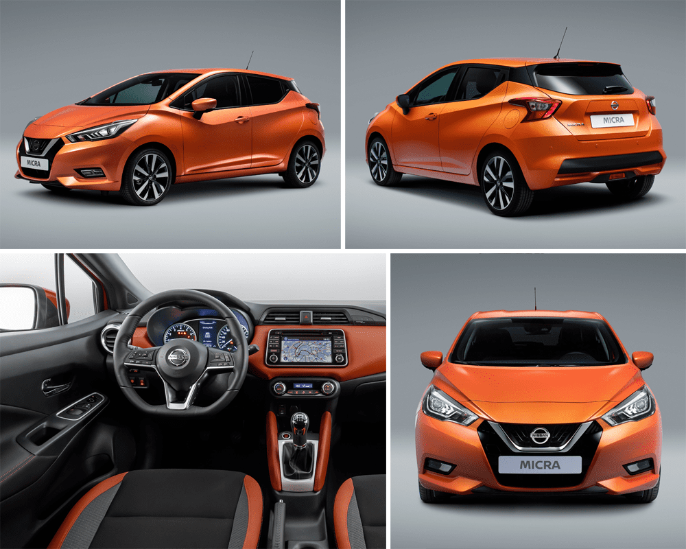
Nissan Micra
With a design based on the Sway concept car of 18 months ago, the fifth generation Micra is the most extravagantly looking Micra to date. Now that the Micra is no longer a wallflower, Nissan is serious about its ambitions for this car and will return production to Europe, for the first time in a Renault factory in Flins, France alongside the Clio.
Kriss: Hot
After seriously losing its plot with the developing-country-centric previous model, Nissan strikes back with a vengeance thanks to this great-looking supermini. It even promises to inject some much-needed flair into the interior through color-coordination with the exterior. The only problem is that when you look at it side-by-side with the Clio it’s hard to escape just how similar the two cars are. Still, if you’ve got to base your model on another supermini, the handsome Clio is a good place to start.
Bart: Hot
At last a Nissan subcompact that has a shot at competing in Europe! The first three generations, though reasonably successful, were so boring I barely remember what they looked like and for the last generation Europe was just an afterthought, with a size that set it between the A- and B-segments and a design that was simply unappealing. This new one looks awesome: expressive but not too extreme. The only thing I’m not convinced of is the C-pillar bump in the line that runs from the bottom of the side windows, which Nissan also did on the Chinese-market Lannia.
BMW X2 Concept
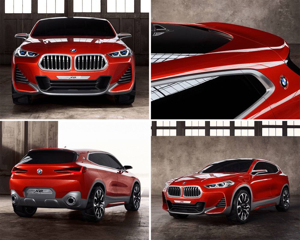
BMW aims to fill any hole in its line-up, which means there’s still room for an X2 crossover coupe alongside the recently renewed X1. The X2 is designed with a different shape than the larger X4 and X6 crossovers, as the production version will share its FWD-platform with the X1. This is a pretty realistic study of what that model will eventually look like, and we might even see those BMW badges in the C-pillars again in the future.
Kriss: Hot
The X2 concept looks great, there is no denying it – nice proportions, a muscular stance, an aggressive take on the typical BMW headlamps and neat details, like the BMW white-blue propeller on the C-pillar. What disappoints a bit is that, in pursuit of new forms the designers keep stumbling onto ideas that others have already used, thus making the X2 less recognizable as a BMW than other cars that came before it. Still, a great looking concept!
Bart: Hot
Take away the obvious concept car overstyled design cues like the huge wheels, rear diffusor and those enormous gills in the front bumper, and you’re looking at the final version of the X2, which makes it a better looking car than the X4 and X6. As Kriss mentioned in his post about the X1 look-a-like, that may have something to do with the front-wheel drive layout. It looks like it could eat your kidneys, and that aggressive look belongs on a BMW. I guess that’s also my beef with the X3’s.
Citroën CXPerience Concept
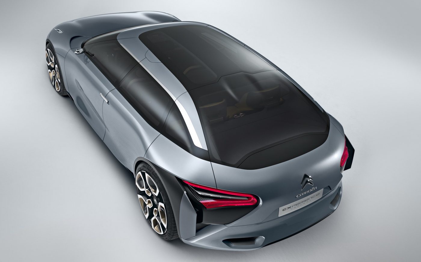
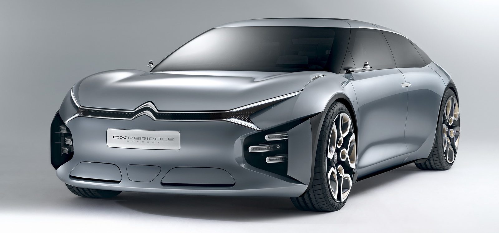
With the CXPerience Citroën wants to usher in a new design language for its larger mainstream cars (that is, not the DS sub-brand). Being almost 4.9 meters long, the CXPerience is roughly the size of today’s C5, but rides on a massive 3-meter wheelbase, evoking memories of the original Citroën DS.
Kriss: Hot
I am a huge fan of Citroën’s current designs, and the CXPerience is no different – it blends simple, smooth surfaces with unique and intricate details, such as the front lights or the disappearing roof rails. Yes, I recognize that the production version won’t look as good because the proportions will need to change, making the car taller and less squat, but this is still a promising start for the announced C5 and C6 replacements.
Lexus UX Concept
Like the BMW X2, this Lexus UX is a pretty realistic looking concept, at least from the outside. Lexus hasn’t confirmed if the UX indeed precedes a production model, but considering the still increasing popularity of luxury crossovers, they’d be foolish not to. The UX may slot below the NX in the line-up and compete against the likes of the BMW X1 (and X2) and Audi Q3.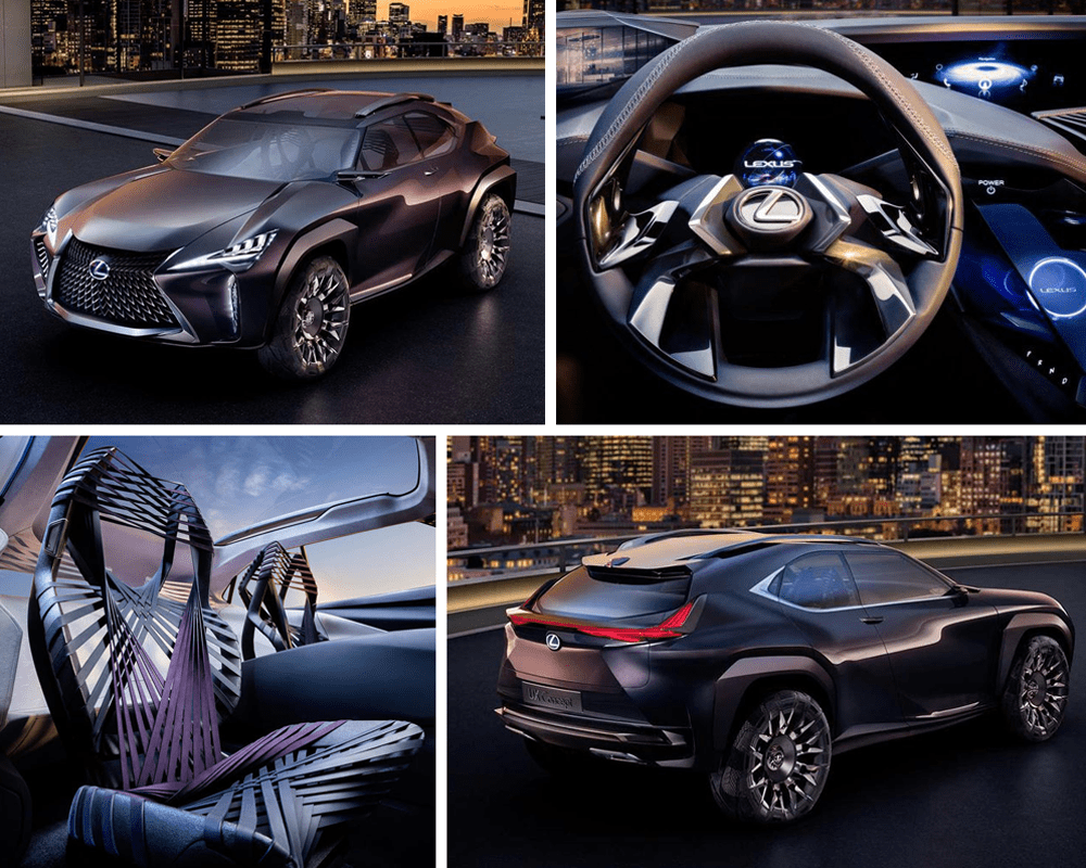
Kriss: Hot
I can imagine this will be an unpopular opinion, but I think the UX looks great because it is so daring! The seats alone, while I can imagine horribly uncomfortable, are worth the price of admission. In an era where more and more carmakers are trying to be more Teutonic in their design, you have to admire Lexus for sticking to their thing, scouring Japanese art (like that of origami) for ideas they can use in their car design.
Bart: Hot
I like the UX as well. Besides the still-too-large spindle grille, I like the bulging front fenders and the overall shape of the car. It somehow looks more European than the current Lexus designs, which are logically supposed to appeal to US and Chinese buyers. Those seats are the next level of minimalist design and weight-saving technology, and I wonder in which way that will ever return in a production car.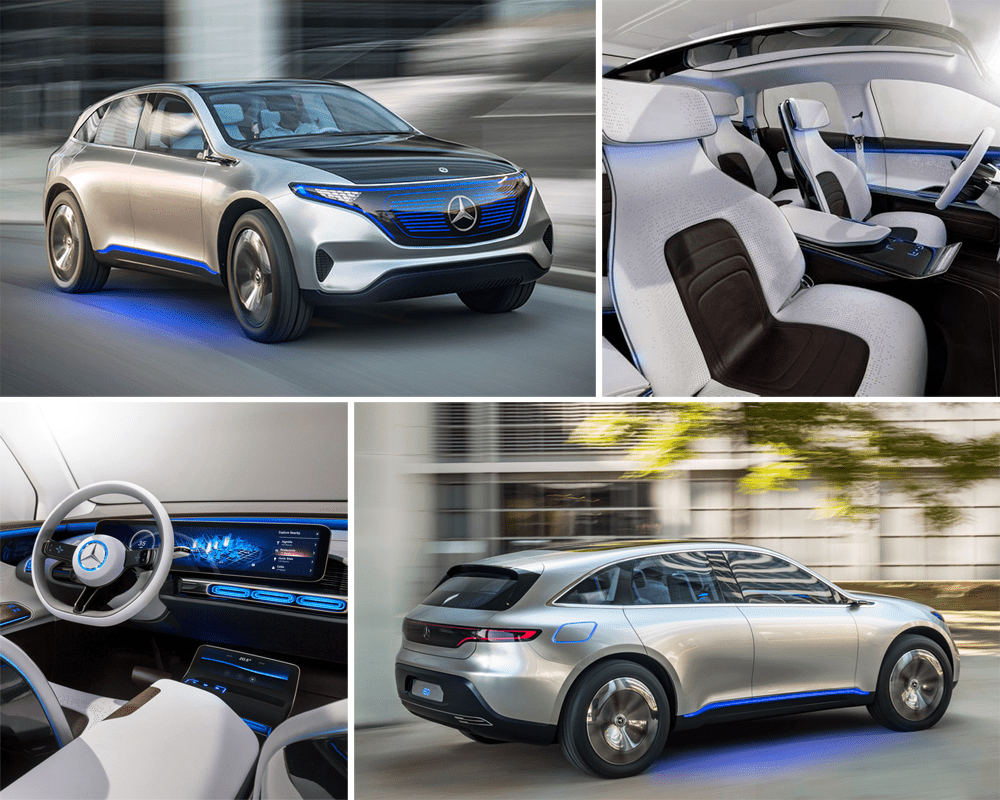
Mercedes-Benz EQ Concept
The EQ is Mercedes-Benz’ first indication of what the cars of its new “green” subbrand may look like. In order to compete with BMW’s i, Mercedes is planning 2 electrified sedans and 2 crossovers in the not too distant future under the EQ label. The name EQ stands for Electric Intelligence and will actually be used in the naming of the models: expect something like EQA, EQC, EQE, EQG etc.
Bart: So-so
I like how this EQ Concept has a much cleaner design than the busy lines of most Mercedes-Benz production cars, and I like the “electrified” version of Mercedes’ trademark grille, but that rear-end is just a bit too retro for me, it somehow reminds me of Mercedes-Benz’s and even (dare I say it?) Peugeots of the 1980’s. On the other hand, the interior looks simply stunning and not even that unrealistic at all. I guess it doesn’t take a lot of fantasy to see the upcoming EQGLC(?) in this car.
Kriss: Hot
There are two ways to view the EQ Concept. As a pure concept car it is rather conservative and, possibly, disappointing to many. However, the EQ seems to be more than that – it looks like a “conceptualized” version of a car Mercedes is already gearing for production. Viewed this way, the EQ previews a very handsome Tesla Model X-fighter with nicer proportions and much more delicate surface treatment than any Mercedes in recent memory.
Mitsubishi GT-PHEV Concept
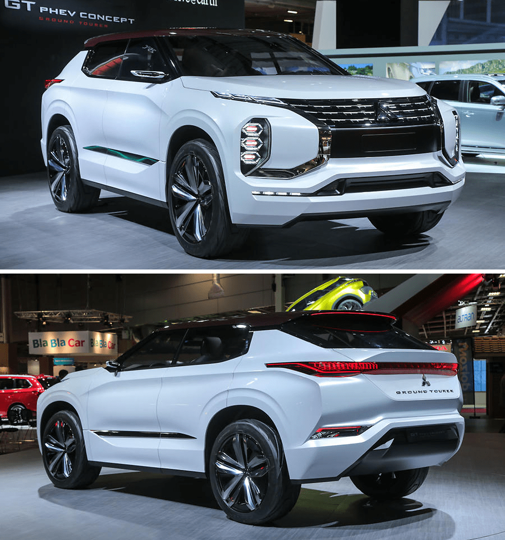
This is a previeuw to the next generation Outlander, featuring interesting technology with its triple electric motors: two on the rear axle and one powerful in front, supporting the 2,5 liter petrol engine. The 25 kWh batteries should give the GT-PHEV a 120 km EV range and a total range of 1.200 km.
Kriss: Not
I don’t get Mitsubishi. As a company that’s teetering on the brink of collapse, common business sense suggests it should be working on bringing a hit car quickly to market, probably a smaller one, since that’s where there is still potential for an outsider to make big waves. Instead, the carmaker is concentrating its efforts on multiple concepts of large, complex, hybrid crossovers that, as best we can tell, are not going to spawn a production model anytime soon. The GT-PHEV is nice-enough looking from the back, but the front looks more like it belongs on the set of Judge Dread from the 1990s. Again, why?
Bart: Not
Kriss already nailed it. This is supposed to show the way to the next generation Outlander, but in a time when the markets favor more subtle and elegant crossovers, Mitsubishi is going the exact opposite direction. I like the mechanical bits with the three electic motors, but it’s not that revolutionary either and besides, isn’t it time to move from PHEV to fully EV now, Mitsubishi?
Renault TreZor Concept
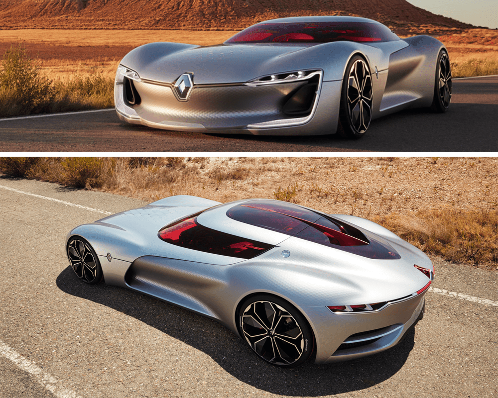
The TreZor electric and (semi-)autonomous sports car shows the way Renault’s design will evolve in coming years. It precedes a handful of more realistic concept cars which will evolve into production models.
Bart: So-so
Don’t get me wrong now, if simply looking at the design of this car, it’s 100% hot. But this is not a car Renault intends to take into production. It’s supposed to give clues about Renault’s evolving design strategy in the way the DeZir did 6 years ago, and with that in mind I must say I’m underwhelmed. Laurens van den Acker has overhauled the entire line-up in those six years and I really like the brand’s current design language, but if those cars are now going to be facelifted with the minor but expressive tweaks that the TreZor shows, like those even bigger “fangs” in the headlights, I’m not sure how that’s an improvement.
Kriss: Hot
If you make a super wide, super low supercar concept, you’d really have to go out of your way to screw it up. Renault hasn’t, and while some of the details are needlessly forced (front LED lights meant to remind onlookers of Renault’s range of production cars), while others needlessly left-field (dimpled surfaces, gigantic clamshell canopy), the end effect is still pretty great. If I was making the next Batman movie, I’d be on the phone to Renault right now, asking if they could make one for me in black!
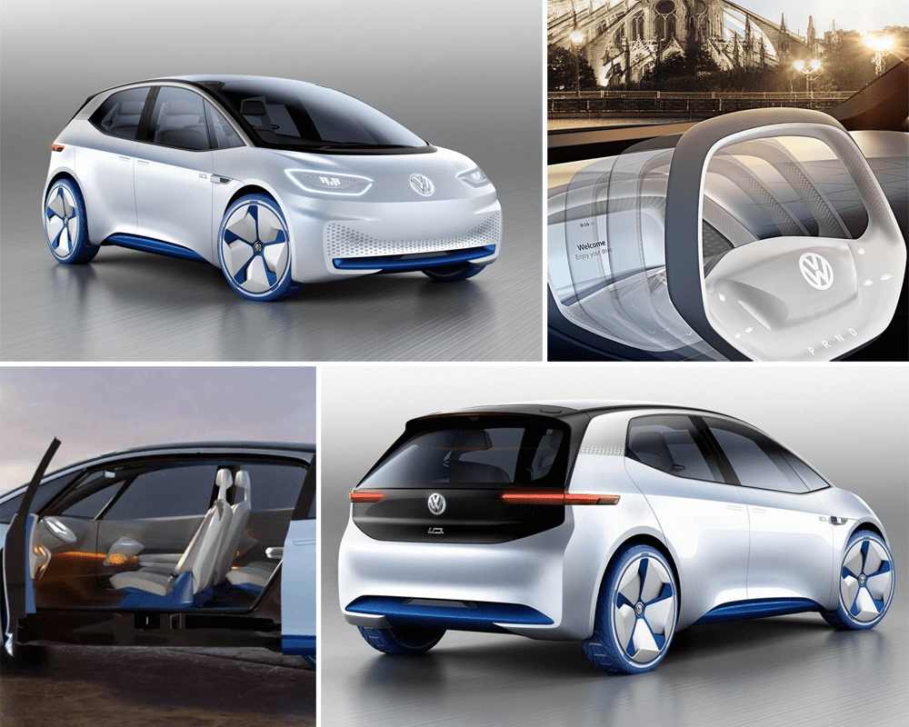
Volkswagen I.D. Concept
This symbolizes the change of priorities for Volkswagen as it focuses on electrification after the diesel scandal. It’s not just a concept of one future model, but of an entire family of cars, as VW Group expands it platform strategy with a MEB platform for all of its future electrified models
Kriss: Hot
Much like Mercedes-Benz’s EQ Concept, the VW I.D. Concept could underwhelm at first, as for a show car it is rather plain. However, the I.D. is not just a pie-in-the-sky concept car – it is a preview of VW’s new electric mainstream car, and as such it looks rather promising. Being a big fan of the VW Up, I like how its characteristic headlamps make their way onto the I.D. in a futuristic form, while the interior space concept and the exterior glasshouse that encapsulates it looks nicely dynamic, and quite unlike anything that VW produces right now. Only the rear lamps disappoint – their aggressive squint seems out-of-character with a car that otherwise seems to be smiling at other road users.
Bart: Hot
This car is interesting even just for what is stands for. And despite being an electric concept car, this model still looks so very Volkswagen, it’s almost impressive, whether you like that or not. I mean, this could easily be the Golf VIII if you take away some of the concept car gadgets.


