Cadillac XT4
Bart: so-so
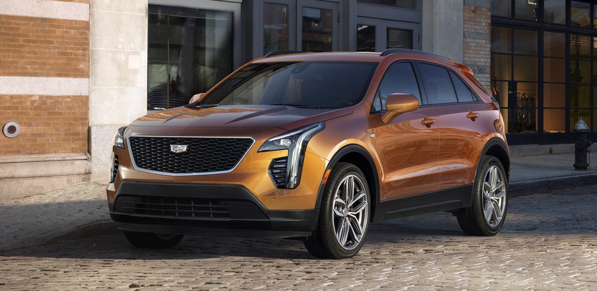
The XT4 is Cadillac’s first entry in the compact SUV segment to rival the BMW X1, Mercedes-Benz GLA and Audi Q3. Its larger sibling XT5 is the leader of its class, and of course the brand aims to beat the Germans in this segment too. However, I think Cadillac could have done a better job at giving the XT4 a more distinctive look, as it now seems too much like a shrunken XT5, especially when seen from the front. The rear end has a few original touches but not enough to give the overall design a wow-factor. It’s not that the XT4 is ugly, I will be the first to agree it’s much more balanced and less overdesigned than it rival-to-be Lexus UX we saw earlier this month in Geneva, but it all just feels a bit too safe. On the other hand, the XT5 is selling well and the Germans are experts at successfully selling different sizes of the same design, so I can’t blame GM for its attempt to follow the same strategy.
Kriss: hot
I was on the fence whether to give the XT4 a “hot” or “so-so”, but ultimately realized that I view this car as “hot”, just one that seems to be lacking a final polish. First, the good stuff – the car looks really good to my eyes, mixing Cadillac’s old and new design cues with elements of the Volvo XC40; the interior has a nice shape to it, complete with a trapezoidal touchscreen; and the mechanical makeup seems very competitive with a 2.0 turbo engine and on-demand AWD. That said, I agree with Bart that its styling is on the conservative side, which is fine by me, but more importantly it seems a bit too close for comfort to the XT5 (though that may be more of a problem for that car). But while the design foundations are very sound, the overall effect is spoiled somewhat by an excess of cheap-looking cladding on the lower parts of the body, a greenhouse that’s a bit too reminiscent of the 2005 Kia Rio, and an interior that looks a bit too sombre when decked out all in black. Still, a great effort by Cadillac, and I’m sure one that will have great market success!
GMC Sierra
Bart: hit
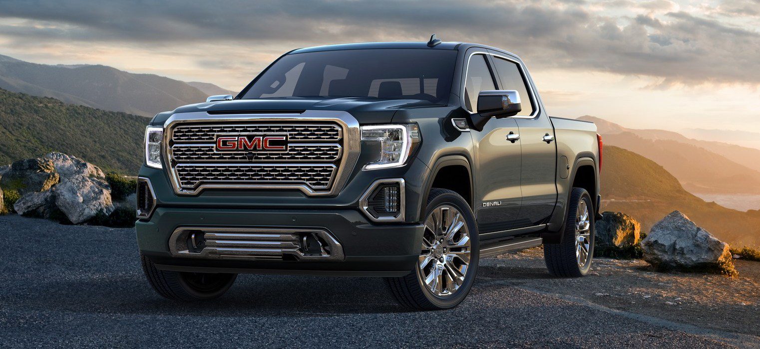
The all-new Chevrolet Silverado was launched less than three months ago in Detroit, and it got a thumbs up from both Kriss and me. The 2019 Sierra has a design that sets the twins further apart than ever before, but I’m still undecided about the styling. I think it has the right kind of masculine attitude to it, but I wouldn’t necessarily call it handsome. But like for the Chevy, the big news comes from the tech department. For starters, the top-of-the line Sierra versions will become available with an optional carbon fiber bed which provides “best-in-class dent, scratch and corrosion resistance”, according to GMC. While this still needs to be proven and cost-of-repair will be significantly higher than a steel version, it does offer another 62 pounds (28 kg) weight savings, adding up to a total of 360 pounds (163 kg) compared to the current model. And the Denali and off-road focused AT4 versions that get the optional CarbonPro bed are unlikely to be the ones that suffer the most in terms of heavy duty bed usage. The second interesting invention is the MultiPro Tailgate which has six unique functions including a standing workstation mode and an egress mode which acts as a step and a seating position. Especially those who thought a tailgate was just a simple hatch that wasn’t worth modernizing or who expected just another gimmick should be impressed by the added functionality of this tailgate.
Kriss: hit
This was a tricky one for me – while the new Sierra is a pretty impressive car, I simply prefer its sibling, the new Chevy Silverado, in terms of design and its clear image. That said, the technical innovations that Bart so accurately described are all undeniable, and to many the Sierra’s old-fashioned “butch” styling will be more appealing than the creases on the Silverado.
Kia K900
Bart: not
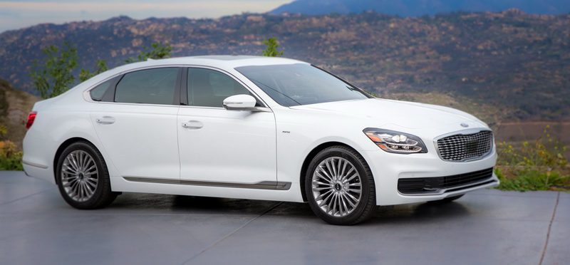
Despite selling just over 5.000 units in the US in four years time, Kia gives the K900 another shot at the luxury full-sized sedan market. As its sibling Hyundai Equus has now been moved to the upscale Genesis brand as the G90, the K900 is now the only model in its class from a mainstream brand. And while this may not be a reason for a lack of success, if it really wants to succeed the recipe would be to do things significantly different that what the competition is offering, especially in terms of styling. Unfortunately, Kia has given its new limousine an even duller look than the outgoing generation, something some may not even have considered possible. The K900 has nothing of the sharpness or attractiveness that it has proven capable of with the Stinger, at a time when Lexus is finally daring enough to instill its usually uninspiring flagship LS with some character and given it a ballsy design.
Kriss: not
I am absolutely with Bart on this one – to me the new K900 seems to be an old-fashioned luxury model “by-the-numbers”, the way that Japanese and Korean carmakers used to produce for their domestic markets before they learned how to compete on the global scale. Objectively, it does not seem to be lacking anything in particular, but subjectively it is so uninspiring that it’s almost offensive. It really seems like the marketing and design group responsible for this car was a completely different one from that which gave us the Stinger. Such a shame, too, because I feel like given the right resources and free reign Peter Schreyer and Luc Donckerwolke could produce something truly wonderful in this class.
Lincoln Aviator Concept
Kriss: so-so
There are two ways to view the Aviator. By comparing it to the first generation model, a Ford Explorer with a different grille, or even Lincoln models from five years ago, you might conclude that this is a rather attractive and progressive car. But then another way to see it is as a design that tries to take the ultra-stylish Range Rover Velar, and evolve it into a Lincoln by adding Lincoln design cues and inflating the car to accommodate three rows of seats. When viewed this way, the car looks bloated and oddly disjointed in places (such as a the front), kind of like a Chinese copy would, or even worse, one of those “inspired by real cars” designs in the Grand Theft Auto video games. Add to that a rather scattershot interior with, again, weirdly underdeveloped features (an oddly-fitting rectangular binnacle, a floating infotainment screen that seems as thick as a first-generation plasma screen, a “drive select” controller that seems lost on the wide central console), and the overall impression is of a car whose design was rushed. Let’s hope the production model is better.
Bart: hot
As Kriss compares the Aviator to the Velar, I’ll counter that argument by comparing it to the first generation Aviator and current Lincoln models. And in that light the Aviator does seem like a serious attempt for the brand. The previous generation Aviator, sold between 2002 and 2006, was based on the Ford Explorer and looked a lot like a baby Navigator. Those two characteristics will carry over into the 2020 Aviator which will arrive next year largely unchanged from the Concept. It will also be based on a new rear wheel drive platform of the new Explorer, which also means it is likely to be offered with a plug-in hybrid option. The new Aviator will offer 3 rows of seats and slot between the Nautilus (the new name of the MKX) and the Navigator and may even replace the Continental sedan as that body style just doesn’t seem to be working anymore for Lincoln. I personally am a fan of the design of the new Navigator, but I must admit I have a weak spot for mastodontic SUVs like it, but I must say that the design works great on a more reasonably sized model too. The clean lines and almost Range Rover-like appearance make for one of the most attractive models in its segment and the interior wouldn’t be out of place in a Mercedes-Benz if that brand hadn’t moved on from the stand-alone screen on top of the center console to the more pleasing integrated double-wide screens.
Nissan Altima
Bart: so-so
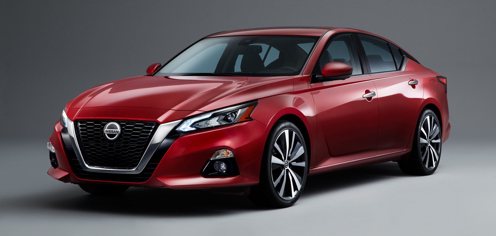
I’m still on the fence about the new Altima. While the Altima is pretty good looking overall, I’m not yet convinced by a few details. The side view is a bit too busy to my liking, with those sharp creases that Kriss mentioned, and I’m not sure if I like the grille that runs so far down. Sure, it gives the Altima a confident look, but how will it turn out in real life, especially with a license plate attachted to the front-end? But to me the biggest surprise with the introduction of the new Altima is that its optional V6 engine will be replaced by the high-tech Variable Compression 4-cylinder that debuts in the Infiniti QX50. Placing this advanced technology in its bread-and-butter sedan so quickly after launching it at its luxury brand indicates the importance of the Altima for Nissan. And to underscore that even further, the midsized sedan will get an optional All Wheel Drive system borrowed from the Rogue to help it stand out from its main rivals Camry and Accord, especially in Snow Belt regions. Of course the Altima will also feature Nissan’s ProPilot semi-autonomous drive tech, as all these features combined make this perhaps the most technologically advanced model in its class, for now.
Kriss: hot
The new Altima is a peculiar car – it’s aggressive front with a giant “eagle beak” grille promises a radical departure for the class, but pretty much everywhere else the Altima is quite restrained. Importantly, though, almost everything is well executed – from the sharp creases in the doors, through the attractive alloys, and down to the Maxima-aping rear (though it also has strong overtones of the Lexus GS). Inside, too, the Altima seems rich and well-executed for the class, with an appealing clean design based around horizontal lines, a stylish steering wheel, an elegant set of HVAC controls, through to the air vents’ interesting 3D shape and execution. Sure, some design elements grate (the fake C-pillar link between the side and rear glasshouse, the oddly-small central vents / infotainment combo), but overall it’s a confident, modern design, even if it does not move the game on in almost any ways.
Subaru Forester
Kriss: not
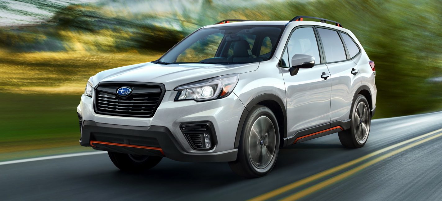
OK, how do I put this nicely… the Subaru Forester is one of the ugliest, laziest, most “un-design” designs I have seen in a long time. Seeming like a different execution of the sketches that gave us the previous generation, the latest Mk V model looks taller and much more ungainly, with detailing that really begs the question of “who signed off on this”. What’s more, the size of the gaps (or at least the way they appear in the pictures) makes this car seem like a Chinese knockoff from the past decade – not a great start when you want to convince customers that your car is “quality”. Add to that an utterly uninspired interior design with some laughable attempts to add youthful color in just three places in the whole cabin, and one has to wonder whether Subaru may not have been better off continuing to sell the Mk IV model, and pocketing the R&D costs.
Bart: not
I think Kriss hit the nail on the head with this one. There’s very little visual attractiveness on the new Forester, and everything looks just so familiar even though it rides on Subaru’s new platform. But then again, this is Subaru at its best and doing exactly what it has been doing for the last decade or so, and quite successfully (in the US, that is). One would expect that as the brand continues to grow it would become more mainstream and middle of the road as it would try to appeal to a larger audience, but instead it stays weird and continues to go its own way yet still it manages to outsell Hyundai and rank #7 in the US brands ranking, continuing a 75-month winning streak of year-over-year gains. The Forester is a great contributor to that success as the brand’s second best seller after the Outback, so why change a winning recipe?
Toyota RAV4
Bart: hot
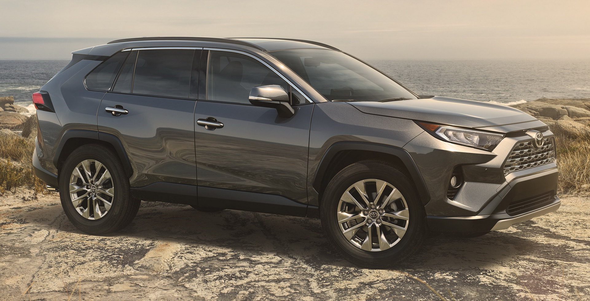
The new RAV4 has some big shoes to fill, as the nameplate has just become Toyota’s best seller in the US. The Camry has just been renewed and offers more characteristic design, so the RAV4 couldn’t stay behind. I like how the brand has quickly turned around from bland and inoffensive to more daring design, even though it may not directly appeal to me personally. For starters, it shouldn’t be a surprise to regular readers that I dislike (most) two-tone designs with a different color roof. I also think the line that runs from between the rear wheel arch and the door handle into the D-pillar makes the rear-end look too fat and heavy. But at least it now has some character and stands out from the crowd. I also like how there appear to be two different versions of the front-end, one more sporty and the other more classy. Too bad they seem to have run out of inspiration for the interior, which is a bit of a let-down after a promising exterior.
Kriss: not
I understand that many people are excited because the new RAV4 does not look anything like the last one, but I’m not sure that’s such a good thing. I, for one, feel like the RAV4 looks like a super-edgy version of the Jeep Cherokee, which once again highlights how Toyota’s styling swings between model generations without much continuity. Overall, I feel the design is heavy-handed and under-developed, while the interior feels cheap and uninviting. It may not be as bad as the new Subaru Forester, but that is not really saying much…
VW Atlas Cross Sport
Kriss: so-so
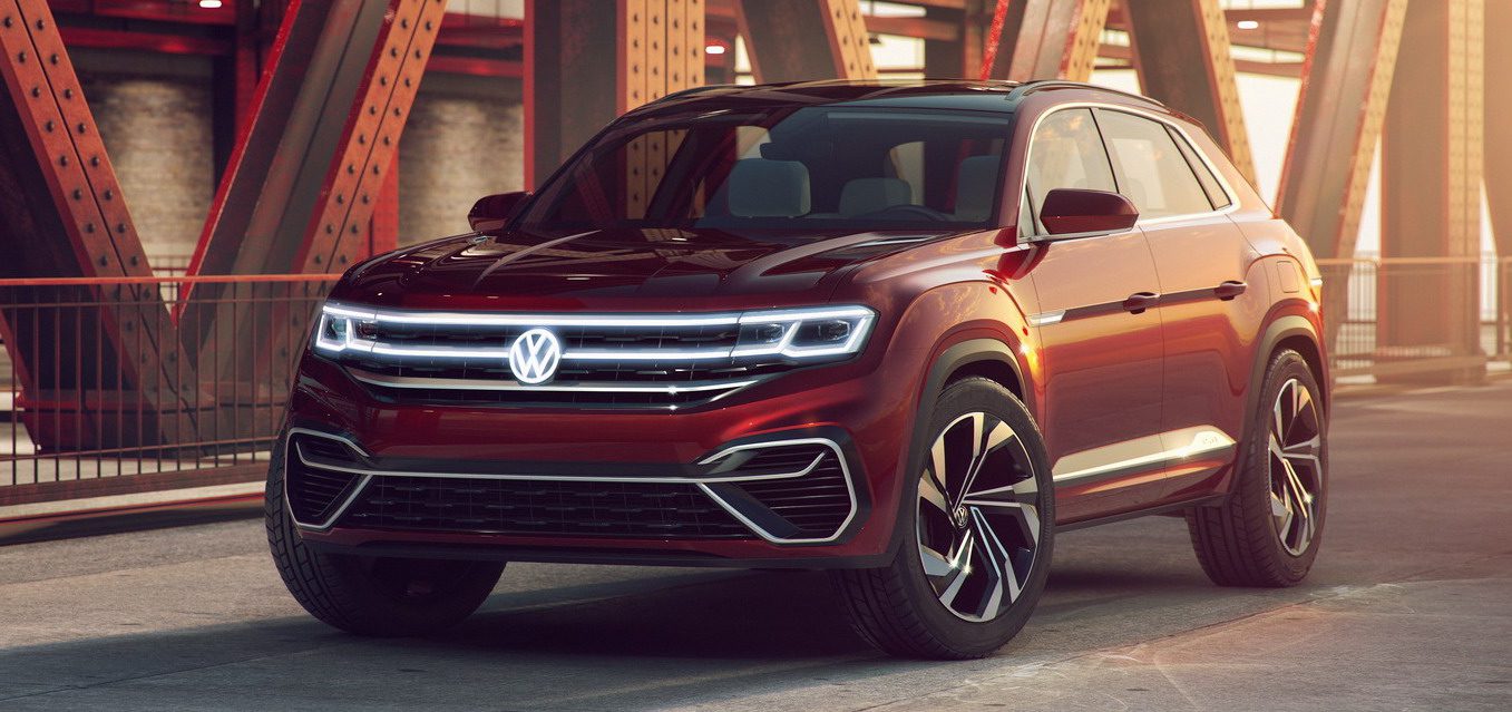
The Atlas Cross Sport is an interesting beast – a rehash of a three-year-old concept (the Cross Coupe GTE), it actually still looks good and, if it were put into production in a form close to the concept, should give cars like the Ford Edge and Nissan Murano a run for their money. That said, the Atlas is so conservative that if the production Cross Sport borrows too much from that car (which it really has to, for economies of scale) than there is a fear that it will fail in attracting customers who had previously shunned the full-size Atlas. To make the Cross Sport succeed VW should think long and hard about how best to inject the production version with some proper pizzaz.
Bart: so-so
Like the Atlas Tanoak Concept discussed below, the Atlas Cross is not yet confirmed for production, but it looks very production ready. The brand also introduced two Tiguan-based family crossovers in China to fit between the Tiguan and the Atlas, but the Atlas Cross is based on the latter and aimed at the North American market, proving that VW really wants to please Americans with large crossovers developed specifically for and made in the US. While the concept doesn’t necessarily look unattractive overall, I can’t help feeling a bit disappointed that it offers little surprises in terms of design, looking like an SUV-Coupe version of the Atlas. Of course, some of the interesting touches of the concept, like the light bar grille, won’t make it into production, which means what will be left after the design is finalized for production will be just another bland crossover.
VW Atlas Tanoak Concept
Bart: hot
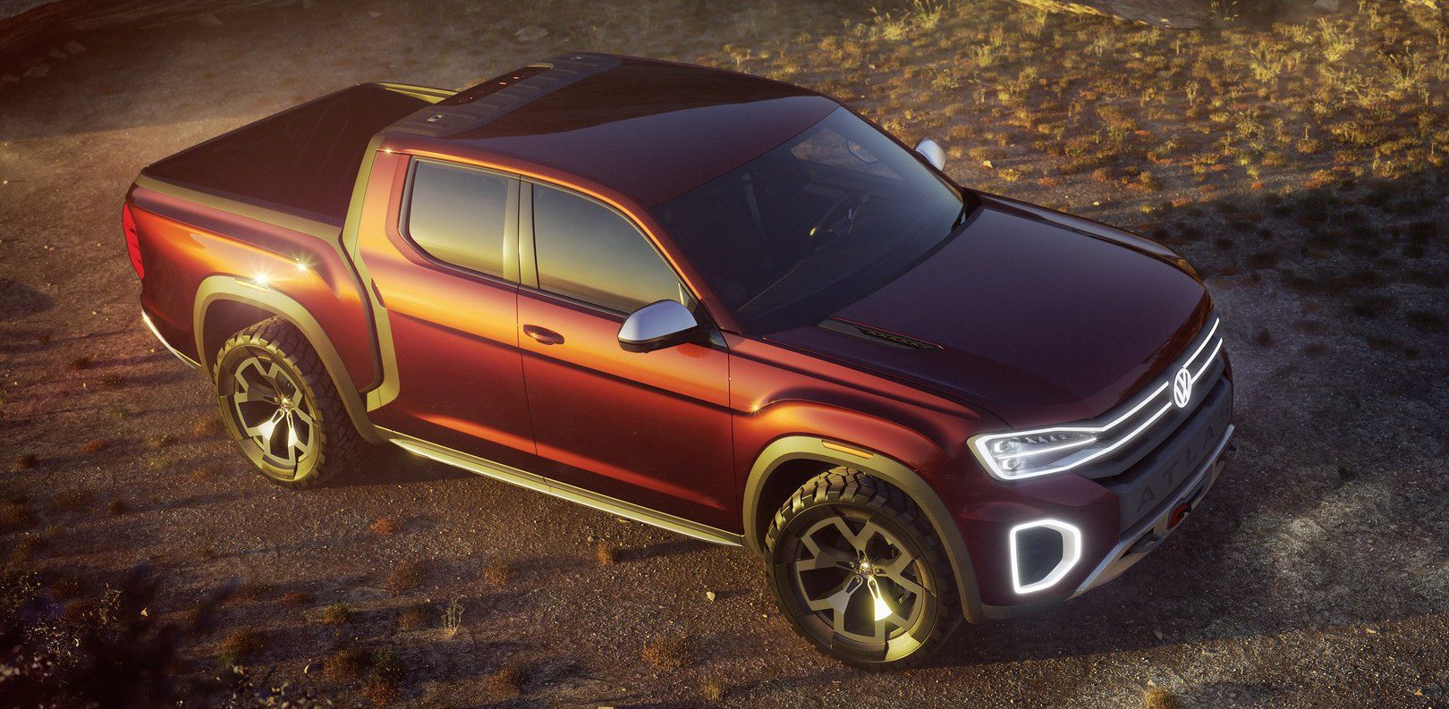
It was about time for VW to come up with a pick-up truck to prove that it takes the North American market seriously again. Sure, it’s still a concept and VW claims there are no plans to make it into a production version, but don’t be fooled by that. This should be a no-brainer for the German brand. That makes in even more surprising they’ve chosen a tongue-breaker name again, after ditching Teramont (the Chinese name of the same vehicle) for Atlas, which is indeed a lot easier and more appealing to Americans. Sizewise they’re on the right track as well, as it fits between the full-sized and mid-sized trucks, which means it doesn’t have direct competitors and if they’re able to price it competitively to the midsized segment it may even have a shot at (minor) success. Unfortunately, VW won’t use the body-on-frame construction of the midsized Amarok pick-up that it sells in most of its other markets, as the Atlas Tanoak is based on the unibody Atlas crossover. Together with the Honda Ridgeline (which is smaller) and the promised Hyundai pick-up (which will be even smaller again), this will be the only unibody pick-up on the market. The hidden rear door handles are a nice touch and in contrast to the Atlas Cross, this looks like it could turn into not a bad looking truck even in production guise.
Kriss: hot
I am a bit conflicted on this one. On one hand I think it looks great and, like Bart, I think there would be a strong message about just how seriously VW takes the American market if it were to put the Tanoak into production. On the other hand, though, I feel like VW is smart enough to recognize that the pickup market is actually a tough one to crack, and as such the Tanoak is probably more of a ploy to bring attention back on the production Atlas and the incoming Coupe model. In the end, I can’t overlook the fact that this concept just looks and feels right, but I think we should not hold our breath about the Tanoak coming to market anytime soon, if at all.

