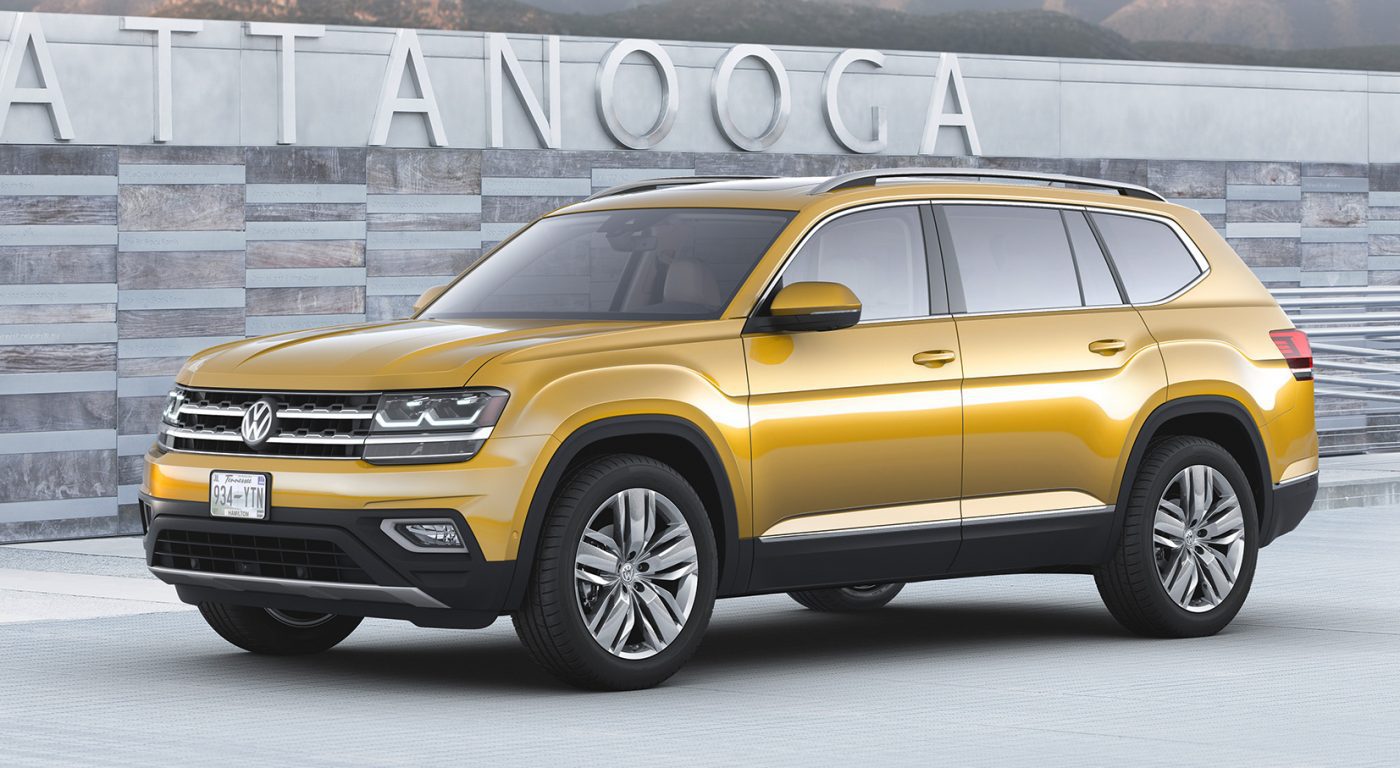
When the VW Atlas was finally revealed after what felt like the longest gestation period the main responses that could be heard were those of disappointment. “This is it?”, most people said, “it’s way too conservative”, said others. And then there was a sizable group of people who thought the Atlas was straight-up ugly, mainly because of the character line that runs down the side of the car. In fact, not only is the concave/convex line controversial, it’s also very reminiscent of the side-treatment another less-than-beautiful SUV received a while back…
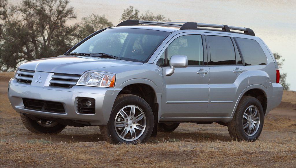
…the Mitsubishi Endeavor. The ill-fated SUV came at a time when Mitsubishi was still trying to offer a whole lineup of cars, and the Endeavor was the brand’s attempt at a mid-sized crossover market. Based on the Galant chassis, the Endeavor tried to stand out from the norm by donning on a butch bodykit that included a strong semi-shoulder-line whose shape is very similar to the VW Atlas. Then as now, it did not go down well with customers, and the Endeavor was one of the least popular car in its class.
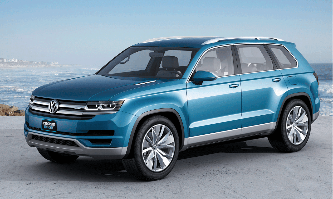
What’s even more baffling is that VW actively chose to add this design element to the Atlas, seeing as the concept version of the car, the Crossblue, did not have it. If I was to play devil’s advocate I could imagine what the VW designers were thinking, in that the character line does break up the visual bulk of what is a gigantic car by class standard, but I really feel like it could have, and should have, been better executed.


