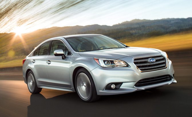
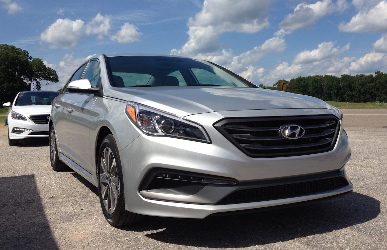
When the seventh generation of the Hyundai Sonata came out in 2014 there was a strong sense of disappointment, as the new model seemed to have lost most of what the previous, game-changing generation so special. Gone were the bold swoops and a coupe-like shape, replaced with a more “mature” design that was neither as sophisticated or as original as the best rivals. It is easy to understand what Hyundai was going for, trying to appeal to conservative buyers without alienating those who liked the design of the sixth generation, but it is fair to say the execution should have been better. Consumers noticed and voted with their wallets: the seventh generation has so far been unable to match the annual sales figures of its predecessor.
But to me the worst thing about the seventh generation Hyundai Sonata is that, if you squint, it could easily be confused with many other cars in the segment. The similarity is closest to the current generation Subaru Legacy – the front lights are almost identical, all the way to the slight “droop” on their outer edges, while the grilles have the same basic shape and hood cutline, even if Subaru’s grille is a bit taller. Now, there is nothing wrong with copying/arriving at the same attractive solution (see, for example, the squinty headlamps of the Mazda CX-5/Infiniti QX60), but the Sonata/Legacy’s fronts are not even that attractive. You have to wonder whether the designers, under the watchful eye of the Hyundai/Kia design honcho Peter Schreyer, was given a brief from up high to position the Hyundai as a “mature” brand, as opposed to the “sporty” Kia, and went too far in sapping any emotion from the Sonata’s design…


