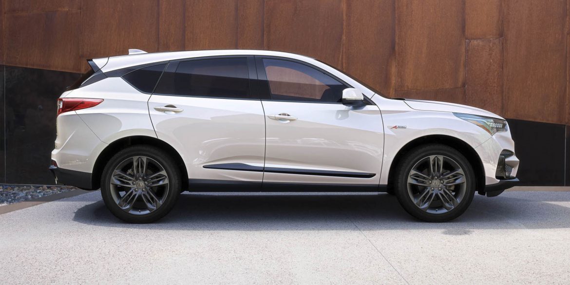
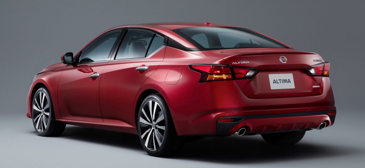
As the 2018 New York Auto Show develops two recent trends have come to the fore: the D-pillar “side-line” and the move towards free-standing infotainment screens. Here, we’ll look at the former, evident in new cars such as Acura RDX, Nissan Altima and Toyota RAV4. Clearly, beauty is in the eye of the beholder and everyone will have their own personal take on the side-line, but seeing as this is one of the car design trends of the recent years I figured we’d try to look at whether this will be one of those things that we remember fondly when we look back at car design (chrome bumpers, 1960s-style fins on American cars, pop-up headlamps) or one that will make us cringe (fake exhaust tips, fake wood panelling, vinyl roofs, 1980s digital car displays).
The case “for”
When well executed, the line connecting the side and the rear windows can really add to a car’s dynamic appearance. An example of this is the new Acura RDX (above), whose D-pillar line is an extension of the receding line of its side windows, and merges seamlessly into the bottom of the rear glass. Thanks to this solution, the RDX has a dynamic profile reminiscent of the discontinued ZDX without the compromises forced by that car’s roof also receding quickly towards the back.
Another way in which the side-lines can be beneficial to a car’s appearance is that, if the car comes with the trendy option of the roof being a different color than the body, the side-lines can help draw a line between the two where the body shape does not provide any natural creases. This can help the whole effect look more natural, as is in the case of the new Toyota RAV4 (below) or the Seat Arona, compared to just having the two colors touch in the middle of a C-pillar, say (think Skoda Fabia Mk III, or Renault Captur).
The case “against”
Unfortunately, it seems that car designers can’t always help themselves, and apply the C-pillar side-lines to cars where they don’t really belong, in the hope that this will add interest or dynamism to what is otherwise a pretty ordinary shapes. By far the biggest culprits here are Nissan, who applies this visual cue to all sort of models, from the large Murano and Maxima, down to the small Leaf Mk II, and now again on the new Altima. While the end result is pretty pleasing on the Murano, the same cannot be said of the Maxima or Altima, where the strip looks like a piece of black tape someone forgot to remove from the car, or the Leaf, where it looks contrived and ill-fitted.
So, how will the side-line be remembered?
Like many design trends, there are cases where the side-line can enhance the appearance of a vehicle – such is the case, to these eyes, of the new Acura RDX, the Opel Astra or, to a certain extent, the new Toyota RAV4. Unfortunately, often designers try to force this faddish design details onto cars where they simply don’t belong, such as Nissan’s efforts with its sedans, or on smaller cars where the side-lines are unnecessarily cramped and end up looking unnatural, such as Nissan Leaf. On balance, it is one design detail we will probably look back and wonder “what were they thinking?”, though it would be unfair to say all cars so adorned look bad. And this trend is still nothing compared to Jaguar’s efforts to black out the rear pillar on the XJ and XK Sportwagon Mk I, a hideous idea that the company luckily quietly dropped for the F-Pace and latest XK Sportwagon.


