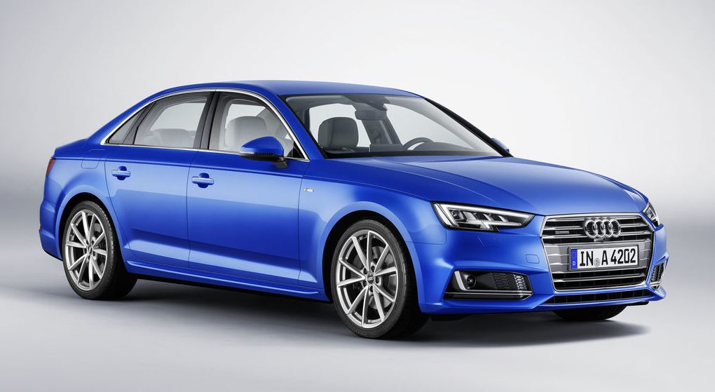
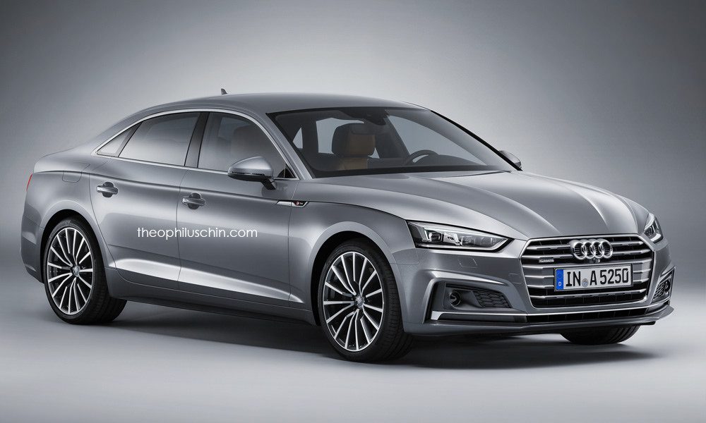
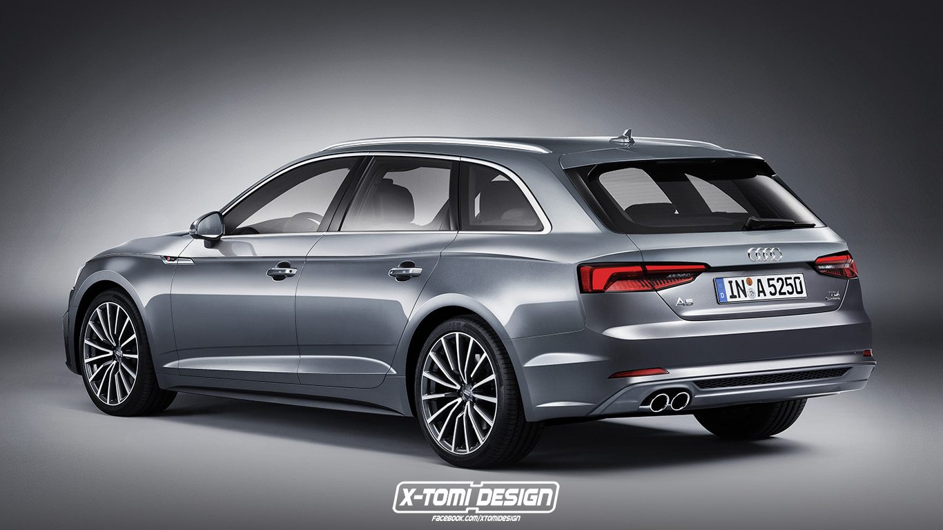
I usually don’t like to engage in speculation about what could have been, but I recently came across two renderings of Audi A5 sedan and Avant that got me wondering: how much more attractive the uber-conservative new Audi A4 could have been if the brands’s designers had been given a free hand?
The renderings come courtesy of two great design pages: THEOPHILUSCHIN (sedan) and X-Tomi Design (Avant). Both are based on the Audi A5 coupe, and attracted my attention because they show just how much more dynamic and, arguably, attractive the Audi A4 sedan could have looked. The changes to the base A4 are not huge, but employing the A5’s swanky side crease that gently bulges over the fender and a swoopy “undercut” in the door design really brings the A4’s side alive, while the front clip gives it a nice aggression that’s missing from the standard sedan.
What I really wonder is this, though: why did Audi style the final A4 sedan the way it did? Was it purposefully trying to be uber-conservative to appeal to a certain audience? Did the designes hold back the best tricks for the A5 coupe, in order to differentiate it from the sedan and give it more swagger? Or is it a matter of design direction, with the A4’s design being frozen before the arrival of Marc Lichte, while the A5 was able to benefit from his new vision?
So, what do you think of the alternative designs? Let us know in the poll and comments below:
[poll id=”71″]


