After all the comparison test victories and value analyses, lo and behold, a noteworthy issue has been found on the skin of Hyundai’s 2011 Sonata. This issue, this irritation, hasn’t stopped thousands of customers from purchasing a brand new 2011 Hyundai Sonata over the last couple of months. It’s unlikely to stop more than a handful of consumers from purchasing a 2011 Hyundai Sonata in the future. But it adds an element of vexation when it comes time to recommend a midsize sedan to a friend, or to The Good Car Nation as a whole.
Full disclosure: GoodCarBadCar.net isn’t “anti-midsize sedan”, but there’s no hiding the fact that less expensive, smaller hatchbacks or slightly more expensive luxury sedans are attract greater appreciation ’round these parts. It would be fair to say that GoodCarBadCar.net is somewhat anti-establishment; the Sales Stats put up by midsize sedans are a sign of success and desirability, but their successes force ubiquity. Ubiquity breeds dullness and boredom. That said, the Honda Accord used to be a member of The Good 12. In The Good 12 v2.0 and The Good 12 v3.0, the Mazda 6 pushed the Accord out. Even the Ford Fusion Hybrid joined the ranks for 2010. In other words, don’t lump this criticism of the 2011 Sonata in with a belief that The Good Car Guy labels all midsize sedans as “bad” – they aren’t. Midsize sedans simply work together to form a category which isn’t a GoodCarBadCar.net favourite.
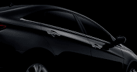
So, what’s the difficulty? There’s a very good reason this wasn’t noticed before. In most Hyundai promotional materials, the 2011 Sonata is painted Radiant Silver. Yesterday, for the first time, The Good Car Guy was up close and personal with an Indigo Blue Pearl Sonata. “Aghast” would not begin to describe the gut-wrenched expression while sitting in front of Steele Hyundai. Oh, Indigo Blue Pearl is a terrific colour. Yet it exposes a design error of, dare I say, epic proportions. Follow the jump to see the error of Hyundai’s ways.
These are midsize sedans. What’ve they got to do with style, what’s the big deal? For a car labelled as a “four door coupe”, a model meant to extinguish memories of boring sedans and reign in buyers who are considering the Sonata’s dull rivals, the 2011 Sonata opens itself up to more criticism than other models. The Volkswagen Passat used chrome to perfection in 2003, wrapping it around its greenhouse – the full circumference of its windowline – with loving tenderness. Many vehicles had used chrome outlines before and have used chrome since with some success. In certain cases it’s overwrought; in others it’s just a classy addition.
Hyundai thought outside of the box with chrome on the 2011 Sonata, with devestatingly poor effects. The greenhouse isn’t wrapped in a thin chrome strip. No, Hyundai only applied chrome on the lower half, right on the hipline. Moreover, Hyundai extended the chrome over the fender alongside the hood up to the pointy extremities of he headlight. What’s worse, there’s a tiny little burst of chrome at the rear of the back door, like your friend forgot to lick the frappuccino leftovers off his upper lip and you didn’t know whether to say something or not. So you didn’t. And he went to work with frappuccino leftovers on his upper lip. People stared. He noticed it at lunchtime in the bathroom mirror. He hasn’t spoken to you in weeks.
This lick of chrome at the rear of the rear door sends a signal that says, “If we had a little more money we could’ve extended the chrome up and around the whole greenhouse but we ran out of money just as we started the arc.” Well, Hyundai, if I may speak to you directly, perhaps a little lot less chrome above the front wheel could’ve been released to play on the upper portion of the windowline.
Oh, who are we kidding? The 2011 Hyundai Sonata isn’t styling perfection sans chrome missteps. Although gorgeous from some angles, it’s dreadful on small wheels, particularly when seen from the front three-quarter view. We’re all ever-so-grateful to Hyundai for shooting into the dark and coming out with something which makes Honda Accords and Toyota Camrys and Nissan Altimas, even handsome Chevrolet Malibus and Ford Fusions, seem dowdy and forgettable. Sales of Hyundai’s Sonata are way, way up. Quite deservedly so. You could spend more money on an ugly car while getting less equipment and worse fuel efficiency in the bargain. Or you could take the Sonata. It doesn’t sound like a difficult choice, and for 22,768 North Americans in May, it wasn’t. They picked up new Sonatas at Hyundai dealerships all over Canada and the USA.
For the record, that chrome strip doesn’t get any worse than when seen on an Indigo Blue Pearl Sonata. Radiant Silver, Camel Pearl, Pearl White and Harbour Gray Metallic hide the chrome strip nicely but aren’t the most exciting paint choices. Phantom Black Metallic is almost as bad, chrome strip-wise, as the Indigo Blue Pearl. Venetian Red is pitiful – the chrome strip jumps out at you like it’ll slather your teeth if you get too close. Pacific Blue Pearl and Iridescent Silver Blue Pearl slide into the middle ground.
What’s Hyundai have to say about the chrome strip? From HyundaiCanada.com: “The most visible result of Sonata’s Fluidic Sculpture design is the signature chrome accent – extending from the headlamps along the hood edge back to the side window line – giving the visual impression of a long, low, light sedan that blends sportiness with elegance in equal measures.” It should be pointed out that the picture Hyundai uses along with this text barely shows a hint of the chrome but is mostly filled with the headlight. Hyundai also made the classic automakers-of-all-stripes mistake of misplacing a “the” in front of Sonata. So it’s, “Sonata’s Fluidic Sculpture design”, as though there is only one Sonata.
Is it possible for the Sonata to overcome the chrome strip, knock out the Mazda 6, and end up in The Good 12 v4.0? Considering the Sonata 2.0T’s horsepower levels, yes, it’s possible.
Related From GoodCarBadCar.net
Hyundai Sonata vs Toyota Camry vs Honda Accord
2011 Volkswagen Jetta Style Analysis
U.S. Sales Of Midsize Cars – May 2010
Hyundai Elantra Driven






I sense your angst.
it will be interesting to read your styling review when the Sonata's other corporate competition hits our shores in the form of the 2011 Kia Optima (or could it be a 2012 model?) no chrome strip on that one!
From a styling point of view, hands down the Optima is the winner.
Certainly the early reveal of the next Optima (bottom Gallery) was appreciated.
Every car has its problems, evena beautiful Ferrari. I don't know why they would do chrome like that either but it wouldn't stop me from buyung a Sonata if I was in the market for a sedan.
One more issue to face.
Picky, picky, picky…
you suck
If you think the Sonata is ugly THAT'S NOT TRUE JUST YOUR OPTION.
One more issue to face.